Supported by Dr. Osamu Ogasawara and  . . |
|
Last data update: 2014.03.03 |
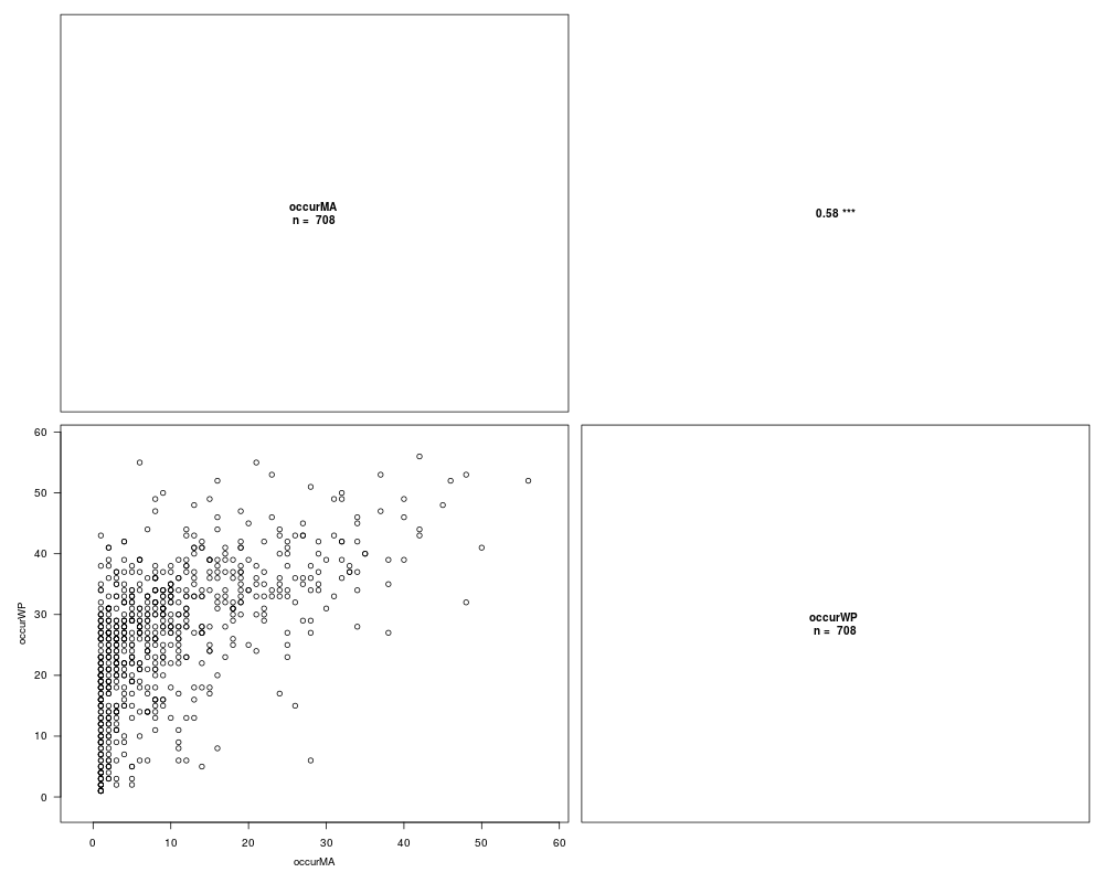
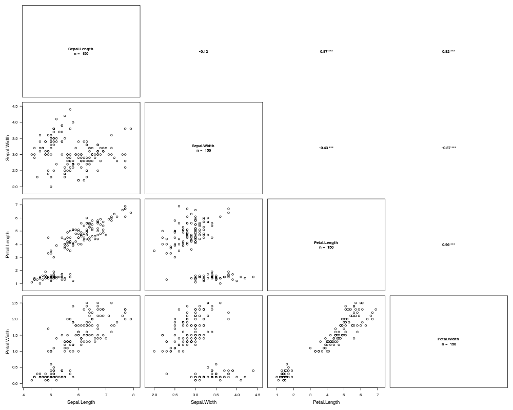
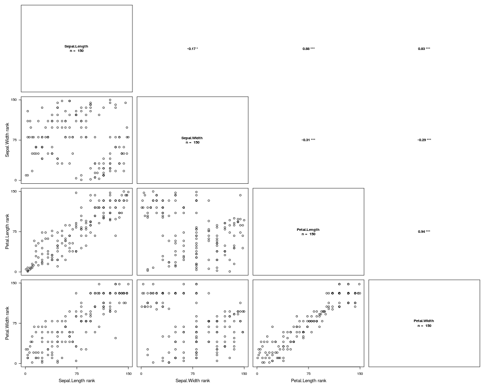
Correlation plotsDescriptionProduces a scatter plot with the distribution of points according to the tested variables in the lower left triangle and the correlation values in the upper left triangle. Usage
corPlot(df, method = "spearman", digits = 2, na.action = "keep", ties.method = "average",
        title = "", xlab = "variable.name", ylab = "variable.name", ...)
Arguments
DetailsThe lower half shows the scatter plots of values or ranks of variables. The upper half shows the corresponding correlation coefficients (significativity: 0 '***' 0.001 '**' 0.01 '*' 0.05 '-' 0.1 ' ' 1). The diagonal shows the considered variables and the number of individuals available for each. If the chosen method is WarningA high number of variables will likely result in a slow generation of plots and a poor readability. Above 10 variables, the readability is greatly reduced. Author(s)Boris Leroy leroy.boris@gmail.com See Also
Examples# Comparisons of species occurrences estimated from 2 different scales data(spid.occ) corPlot(spid.occ, method = "pearson") # Another example: # Correlation between different variables measured on the same individuals data(iris) corPlot(iris[, 1:4], method = "pearson") corPlot(iris[, 1:4], method = "spearman") Results
R version 3.3.1 (2016-06-21) -- "Bug in Your Hair"
Copyright (C) 2016 The R Foundation for Statistical Computing
Platform: x86_64-pc-linux-gnu (64-bit)

R is free software and comes with ABSOLUTELY NO WARRANTY.
You are welcome to redistribute it under certain conditions.
Type 'license()' or 'licence()' for distribution details.

R is a collaborative project with many contributors.
Type 'contributors()' for more information and
'citation()' on how to cite R or R packages in publications.

Type 'demo()' for some demos, 'help()' for on-line help, or
'help.start()' for an HTML browser interface to help.
Type 'q()' to quit R.

> library(Rarity)
> png(filename="/home/ddbj/snapshot/RGM3/R_CC/result/Rarity/corPlot.Rd_%03d_medium.png", width=480, height=480)
> ### Name: corPlot
> ### Title: Correlation plots
> ### Aliases: corPlot
> ### Keywords: ~kwd1 ~kwd2
>
> ### ** Examples
>
> # Comparisons of species occurrences estimated from 2 different scales
> data(spid.occ)
> corPlot(spid.occ, method = "pearson")
>
> # Another example:
> # Correlation between different variables measured on the same individuals
> data(iris)
> corPlot(iris[, 1:4], method = "pearson")
> corPlot(iris[, 1:4], method = "spearman")
There were 32 warnings (use warnings() to see them)
>
>
>
>
>
> dev.off()
null device
          1
>
|