R: Create a plot showing the edges with the highest partial...
dot_plot
R Documentation
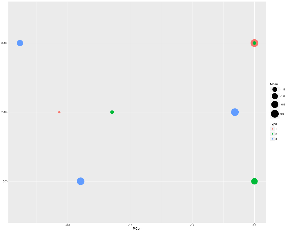
Create a plot showing the edges with the highest partial correlation in any cluster.
Description
This function takes the output of het_cv_glasso or
mixglasso and creates a plot of the highest scoring edges along the
y axis, where, the edge in each cluster is represented by a circle whose area
is proportional to the smallest mean of the two nodes that make up the edge,
and the position along the y axis shows the partial correlation of the edge.
A network clustering object as returned by
het_cv_glasso or mixglasso.
p.corrs.thresh
Cutoff for the partial correlations; only edges with absolute
partial correlation > p.corrs.thresh (in any cluster) will be displayed.
hard.limit
Additional hard limit on the number of edges to display. If
p.corrs.thresh results in more edges than hard.limit, only hard.limit edges with the
highest partial correlation are returned.
display
If TRUE, print the plot to the current output device.
node.names
Names for the nodes in the network.
group.names
Names for the clusters or groups.
dot.size.range
Graphical parameter for scaling the size of the circles (dots)
representing an edge in each cluster.
Value
Returns a ggplot2 object. If display=TRUE, additionally displays the
plot.
Examples
n = 500
p = 10
s = 0.9
n.comp = 3

# Create different mean vectors
Mu = matrix(0,p,n.comp)

# Define non-zero means in each group (non-overlapping)
nonzero.mean = split(sample(1:p),rep(1:n.comp,length=p))

# Set non-zero means to fixed value
for(k in 1:n.comp){
	Mu[nonzero.mean[[k]],k] = -2/sqrt(ceiling(p/n.comp))
}

# Generate data
sim.result = sim_mix_networks(n, p, n.comp, s, Mu=Mu)
mixglasso.result = mixglasso(sim.result$data, n.comp=3)
mixglasso.clustering = mixglasso.result$models[[mixglasso.result$bic.opt]]

dot_plot(mixglasso.clustering, p.corrs.thresh=0.5)
Results
R version 3.3.1 (2016-06-21) -- "Bug in Your Hair"
Copyright (C) 2016 The R Foundation for Statistical Computing
Platform: x86_64-pc-linux-gnu (64-bit)

R is free software and comes with ABSOLUTELY NO WARRANTY.
You are welcome to redistribute it under certain conditions.
Type 'license()' or 'licence()' for distribution details.

R is a collaborative project with many contributors.
Type 'contributors()' for more information and
'citation()' on how to cite R or R packages in publications.

Type 'demo()' for some demos, 'help()' for on-line help, or
'help.start()' for an HTML browser interface to help.
Type 'q()' to quit R.

> library(nethet)
> png(filename="/home/ddbj/snapshot/RGM3/R_BC/result/nethet/dot_plot.Rd_%03d_medium.png", width=480, height=480)
> ### Name: dot_plot
> ### Title: Create a plot showing the edges with the highest partial
> ###   correlation in any cluster.
> ### Aliases: dot_plot
>
> ### ** Examples
>
> n = 500
> p = 10
> s = 0.9
> n.comp = 3
>
> # Create different mean vectors
> Mu = matrix(0,p,n.comp)
>
> # Define non-zero means in each group (non-overlapping)
> nonzero.mean = split(sample(1:p),rep(1:n.comp,length=p))
>
> # Set non-zero means to fixed value
> for(k in 1:n.comp){
+ 	Mu[nonzero.mean[[k]],k] = -2/sqrt(ceiling(p/n.comp))
+ }
>
> # Generate data
> sim.result = sim_mix_networks(n, p, n.comp, s, Mu=Mu)
> mixglasso.result = mixglasso(sim.result$data, n.comp=3)
> mixglasso.clustering = mixglasso.result$models[[mixglasso.result$bic.opt]]
>
> dot_plot(mixglasso.clustering, p.corrs.thresh=0.5)
>
>
>
>
>
> dev.off()
null device
          1
>
 .
.