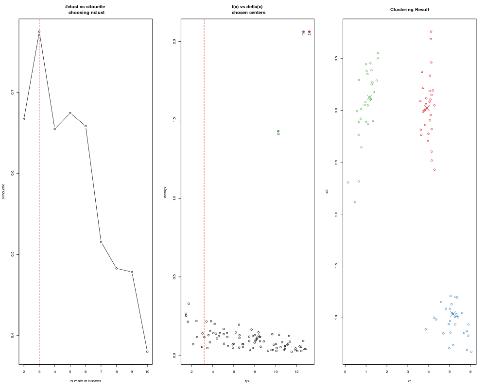
Depends on the settings of adpclust, draw figures showing silhouette vs. number of clusters, f vs. delta with selected centroids, and original data (projected to the first two principal components if dim > 2) colored by cluster assignments.
Usage
## S3 method for class 'adpclust'
plot(x, cols = "default", ...)
Arguments
x
an object of class "adpclust". Result of adpclust().
cols
vector of colors used to distinguish different clusters. Recycled if necessary.
...
Not used.
Examples
## Load a data set with 3 clusters
data(clust3)
## Automatically select cluster centroids
ans <- adpclust(clust3, centroids = "auto")
plot(ans)
Results
R version 3.3.1 (2016-06-21) -- "Bug in Your Hair"
Copyright (C) 2016 The R Foundation for Statistical Computing
Platform: x86_64-pc-linux-gnu (64-bit)

R is free software and comes with ABSOLUTELY NO WARRANTY.
You are welcome to redistribute it under certain conditions.
Type 'license()' or 'licence()' for distribution details.

R is a collaborative project with many contributors.
Type 'contributors()' for more information and
'citation()' on how to cite R or R packages in publications.

Type 'demo()' for some demos, 'help()' for on-line help, or
'help.start()' for an HTML browser interface to help.
Type 'q()' to quit R.

> library(ADPclust)
> png(filename="/home/ddbj/snapshot/RGM3/R_CC/result/ADPclust/plot.adpclust.Rd_%03d_medium.png", width=480, height=480)
> ### Name: plot.adpclust
> ### Title: Visualize the result of adpclust()
> ### Aliases: plot.adpclust
>
> ### ** Examples
>
> ## Load a data set with 3 clusters
> data(clust3)
> ## Automatically select cluster centroids
> ans <- adpclust(clust3, centroids = "auto")
> plot(ans)
>
>
>
>
>
> dev.off()
null device
          1
>
 .
.