Supported by Dr. Osamu Ogasawara and  . . |
|
Last data update: 2014.03.03 |
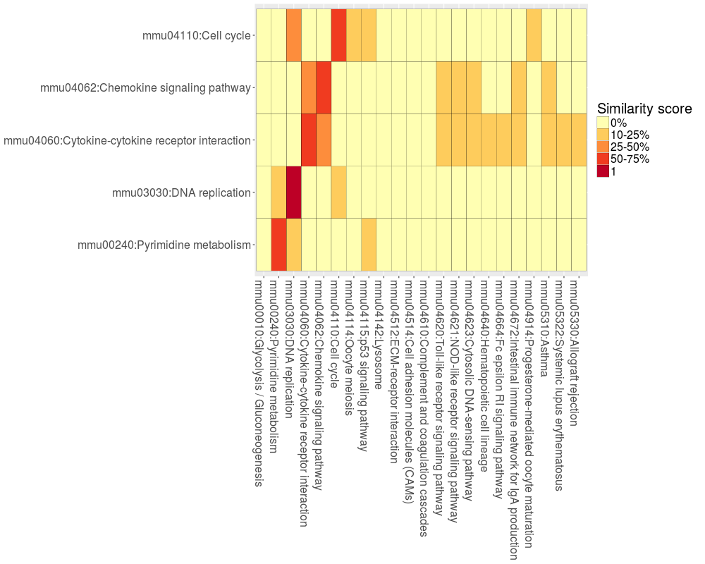
To compute and visualize Jaccard similarity score between two enrichment analysis results.DescriptionComparing two enrichment analysis results, it reveals the relationships existings between annotations found by using two different gene lists. The Jplot() function takes in input two different DAVIDFunctionalAnnotationChart objects (1 and 2) and provides in output a table/matrix with colored boxes. Each box reports the Jaccard index-based similarity score computed between the gene sets enriching two functional annotations. Usage
Jplot(david.obj.1, david.obj.2,  max.pval = 0.01, min.ngenes = 5, title = "Jplot",
       print.term ="full")
Arguments
ValueReturn a ggplot2 graph. NoteThe two DAVIDFunctionalAnnotationChart objects should be associated to two different enrichment analysis results. Author(s)Vittorio Fortino See Also
Examplesdata(result.kegg) jplot.kegg <- Jplot(result.kegg[[4]], result.kegg[[2]], max.pval = 0.05, min.ngenes = 10) jplot.kegg Results
R version 3.3.1 (2016-06-21) -- "Bug in Your Hair"
Copyright (C) 2016 The R Foundation for Statistical Computing
Platform: x86_64-pc-linux-gnu (64-bit)

R is free software and comes with ABSOLUTELY NO WARRANTY.
You are welcome to redistribute it under certain conditions.
Type 'license()' or 'licence()' for distribution details.

R is a collaborative project with many contributors.
Type 'contributors()' for more information and
'citation()' on how to cite R or R packages in publications.

Type 'demo()' for some demos, 'help()' for on-line help, or
'help.start()' for an HTML browser interface to help.
Type 'q()' to quit R.

> library(BACA)

> png(filename="/home/ddbj/snapshot/RGM3/R_CC/result/BACA/Jplot.Rd_%03d_medium.png", width=480, height=480)
> ### Name: Jplot
> ### Title: To compute and visualize Jaccard similarity score between two
> ###   enrichment analysis results.
> ### Aliases: Jplot
>
> ### ** Examples
>
>   data(result.kegg)
>   jplot.kegg <- Jplot(result.kegg[[4]], result.kegg[[2]], max.pval = 0.05, min.ngenes = 10)
>   jplot.kegg
>
>
>
>
>
> dev.off()
null device
          1
>
|