Supported by Dr. Osamu Ogasawara and  . . |
|
Last data update: 2014.03.03 |
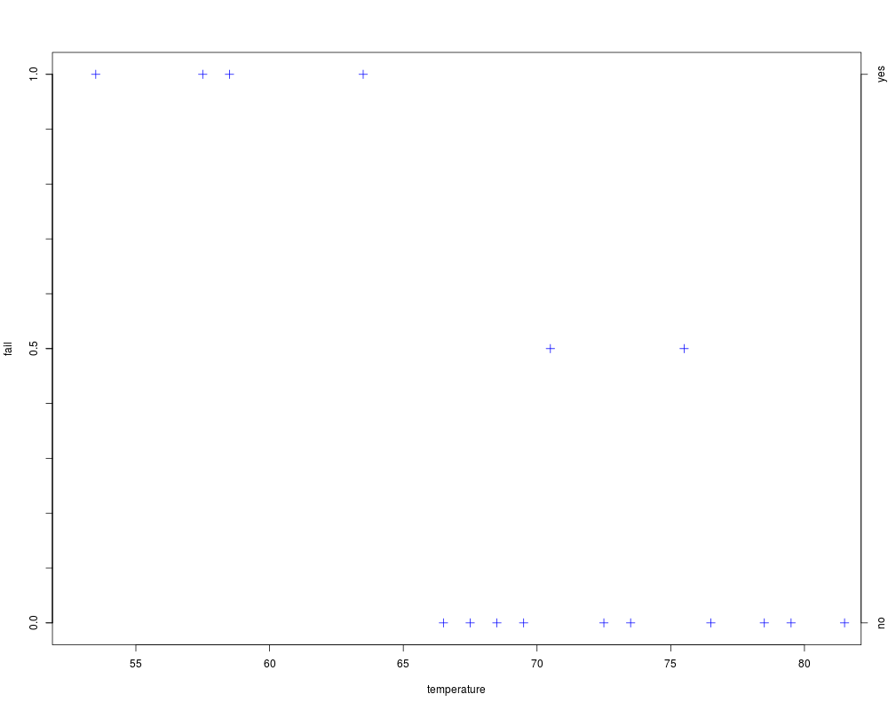
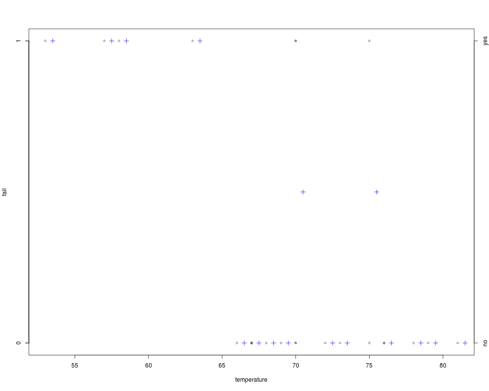
Plots a binary response variable versus a quantitative explanatory variable.DescriptionA function to plot a binary response variable versus a quantitative explanatory variable. UsageplotBinResp(x, ...) ## Default S3 method: plotBinResp(x, y, xlab = paste(deparse(substitute(x))), ylab = paste(deparse(substitute(y))), plot.pts = TRUE, col.pt = "black", transparency = NULL, plot.p = TRUE, breaks = 25, p.col = "blue", p.pch = 3, p.cex = 1.25, yaxis1.ticks = seq(0, 1, 0.1), yaxis1.lbls = c(0, 0.5, 1), yaxis2.show = TRUE, ...) ## S3 method for class 'formula' plotBinResp(x, data = NULL, xlab = names(mf)[2], ylab = names(mf)[1], ...) Arguments
DetailsThis function produces a plot that can be used to visualize the density of points for a binary response variable as a function of a quantitative explanatory variable. In addition, the proportion of “1”s for the response variable at various “levels” of the explanatory variable are shown. ValueNone. However, a plot is produced. NoteThis function is meant to allow newbie students the ability to visualize the data corresponding to a binary logistic regression without getting “bogged-down” in the gritty details of how to produce this plot. Author(s)Derek H. Ogle, derek@derekogle.com See Also
Examples
## NASA space shuttle o-ring failures -- from graphics package
fail <- factor(c(2,2,2,2,1,1,1,1,1,1,2,1,2,1,1,1,1,2,1,1,1,1,1),
levels = 1:2, labels = c("no","yes"))
temperature <- c(53,57,58,63,66,67,67,67,68,69,70,70,70,70,72,73,75,75,76,76,78,79,81)
d <- data.frame(fail,temperature)
## Default plot (using formula notation)
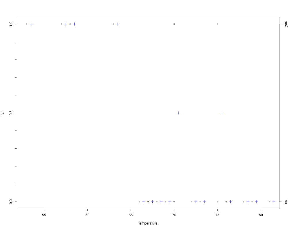
plotBinResp(fail~temperature,data=d)
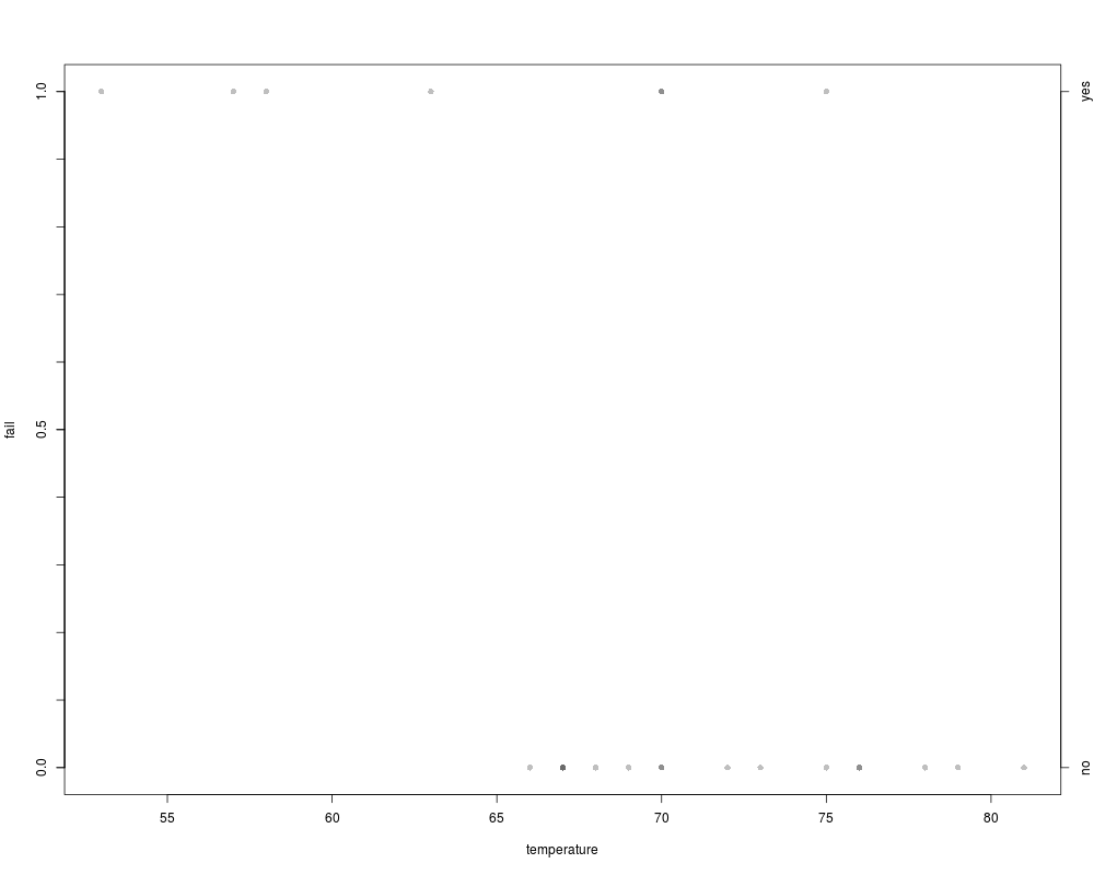
## Controlling where proportions are computed with a sequence in breaks
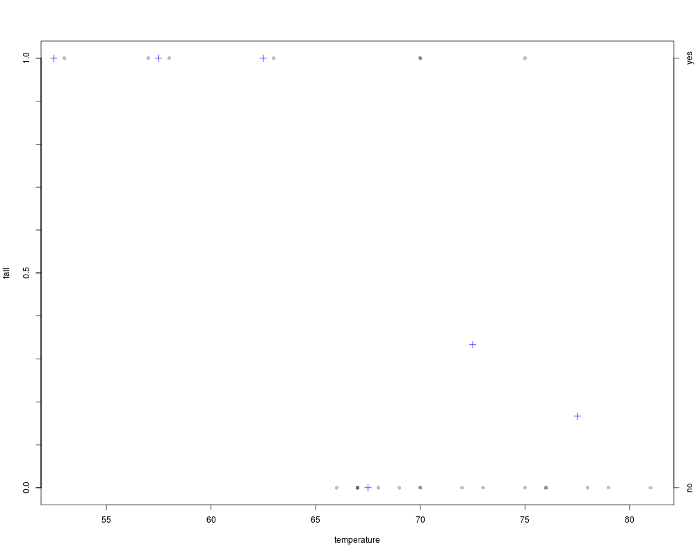
plotBinResp(fail~temperature,data=d,breaks=seq(50,85,5))
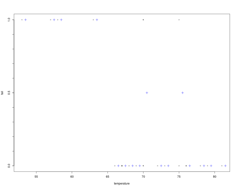
## Controlling where proportions are computed with an integer in breaks
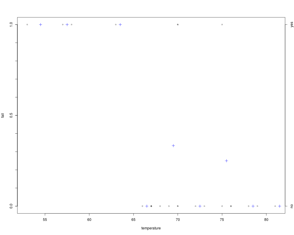
plotBinResp(fail~temperature,data=d,breaks=10)
## Controlling where proportions are computed at each value of x
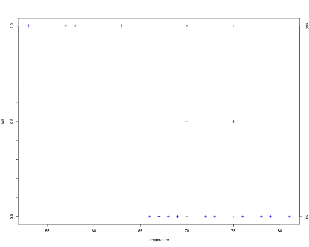
plotBinResp(fail~temperature,data=d,breaks=NULL)
## Don't plot points, just plot proportions
plotBinResp(fail~temperature,data=d,plot.pts=FALSE)
## Don't plot proportions, just plot points
plotBinResp(fail~temperature,data=d,plot.p=FALSE)
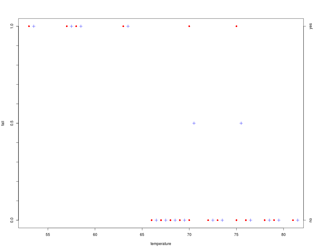
## Change points colors, and eliminate transparency
plotBinResp(fail~temperature,data=d,col.pt="red",transparency=1)
## Remove the right y-axis
plotBinResp(fail~temperature,data=d,yaxis2.show=FALSE)
## Change left y-axis ticks
plotBinResp(fail~temperature,data=d,yaxis1.ticks=c(0,1),yaxis1.lbls=c(0,1))
Results
R version 3.3.1 (2016-06-21) -- "Bug in Your Hair"
Copyright (C) 2016 The R Foundation for Statistical Computing
Platform: x86_64-pc-linux-gnu (64-bit)

R is free software and comes with ABSOLUTELY NO WARRANTY.
You are welcome to redistribute it under certain conditions.
Type 'license()' or 'licence()' for distribution details.

R is a collaborative project with many contributors.
Type 'contributors()' for more information and
'citation()' on how to cite R or R packages in publications.

Type 'demo()' for some demos, 'help()' for on-line help, or
'help.start()' for an HTML browser interface to help.
Type 'q()' to quit R.

> library(FSA)


 ############################################
 ##      FSA package, version 0.8.7        ##
 ##    Derek H. Ogle, Northland College    ##
 ##                                        ##
 ## Run ?FSA for documentation.            ##
 ## Run citation('FSA') for citation ...   ##
 ##   please cite if used in publication.  ##
 ##                                        ##
 ## See derekogle.com/fishR/ for more      ##
 ##   thorough analytical vignettes.       ##
 ############################################


> png(filename="/home/ddbj/snapshot/RGM3/R_CC/result/FSA/plotBinResp.Rd_%03d_medium.png", width=480, height=480)
> ### Name: plotBinResp
> ### Title: Plots a binary response variable versus a quantitative
> ###   explanatory variable.
> ### Aliases: plotBinResp plotBinResp.default plotBinResp.formula
> ### Keywords: hplot models
>
> ### ** Examples
>
> ## NASA space shuttle o-ring failures -- from graphics package
> fail <- factor(c(2,2,2,2,1,1,1,1,1,1,2,1,2,1,1,1,1,2,1,1,1,1,1),
+ levels = 1:2, labels = c("no","yes"))
> temperature <- c(53,57,58,63,66,67,67,67,68,69,70,70,70,70,72,73,75,75,76,76,78,79,81)
> d <- data.frame(fail,temperature)
>
> ## Default plot (using formula notation)
> plotBinResp(fail~temperature,data=d)
>
> ## Controlling where proportions are computed with a sequence in breaks
> plotBinResp(fail~temperature,data=d,breaks=seq(50,85,5))
>
> ## Controlling where proportions are computed with an integer in breaks
> plotBinResp(fail~temperature,data=d,breaks=10)
>
> ## Controlling where proportions are computed at each value of x
> plotBinResp(fail~temperature,data=d,breaks=NULL)
>
> ## Don't plot points, just plot proportions
> plotBinResp(fail~temperature,data=d,plot.pts=FALSE)
>
> ## Don't plot proportions, just plot points
> plotBinResp(fail~temperature,data=d,plot.p=FALSE)
>
> ## Change points colors, and eliminate transparency
> plotBinResp(fail~temperature,data=d,col.pt="red",transparency=1)
>
> ## Remove the right y-axis
> plotBinResp(fail~temperature,data=d,yaxis2.show=FALSE)
>
> ## Change left y-axis ticks
> plotBinResp(fail~temperature,data=d,yaxis1.ticks=c(0,1),yaxis1.lbls=c(0,1))
>
>
>
>
>
>
> dev.off()
null device
          1
>
|