Supported by Dr. Osamu Ogasawara and  . . |
|
Last data update: 2014.03.03 |
Multi-way Summary of ProportionsDescription
The The The Usage
summaryP(formula, data = NULL, subset = NULL,
         na.action = na.retain, sort=TRUE,
         asna = c("unknown", "unspecified"), ...)
## S3 method for class 'summaryP'
plot(x, formula, groups=NULL, exclude1=TRUE,
         xlim = c(-.05, 1.05),
         text.at=NULL, cex.values = 0.5,
         key = list(columns = length(groupslevels), x = 0.75,
                    y = -0.04, cex = 0.9,
                    col = trellis.par.get('superpose.symbol')$col,
                    corner=c(0,1)),
         outerlabels=TRUE, autoarrange=TRUE, ...)
## S3 method for class 'summaryP'
ggplot(data, mapping, groups=NULL, exclude1=TRUE,
           xlim=c(0, 1), col=NULL, shape=NULL, size=function(n) n ^ (1/4),
           sizerange=NULL, abblen=5, autoarrange=TRUE, addlayer=NULL,
           ..., environment)
## S3 method for class 'summaryP'
latex(object, groups=NULL, exclude1=TRUE, file='', round=3,
                           size=NULL, append=TRUE, ...)
Arguments
Value
Author(s)Frank Harrell
See Also
Examples
n <- 100
f <- function(na=FALSE) {
x <- sample(c('N', 'Y'), n, TRUE)
if(na) x[runif(100) < .1] <- NA
x
}
set.seed(1)
d <- data.frame(x1=f(), x2=f(), x3=f(), x4=f(), x5=f(), x6=f(), x7=f(TRUE),
age=rnorm(n, 50, 10),
race=sample(c('Asian', 'Black/AA', 'White'), n, TRUE),
sex=sample(c('Female', 'Male'), n, TRUE),
treat=sample(c('A', 'B'), n, TRUE),
region=sample(c('North America','Europe'), n, TRUE))
d <- upData(d, labels=c(x1='MI', x2='Stroke', x3='AKI', x4='Migraines',
x5='Pregnant', x6='Other event', x7='MD withdrawal',
race='Race', sex='Sex'))
dasna <- subset(d, region=='North America')
with(dasna, table(race, treat))
s <- summaryP(race + sex + ynbind(x1, x2, x3, x4, x5, x6, x7, label='Exclusions') ~
region + treat, data=d)
# add exclude1=FALSE below to include female category
plot(s, groups='treat')
ggplot(s, groups='treat')
plot(s, val ~ freq | region * var, groups='treat', outerlabels=FALSE)
# Much better looking if omit outerlabels=FALSE; see output at
# http://biostat.mc.vanderbilt.edu/HmiscNew#summaryP
# See more examples under bpplotM
# Make a chart where there is a block of variables that
# are only analyzed for males. Keep redundant sex in block for demo.
# Leave extra space for numerators, denominators
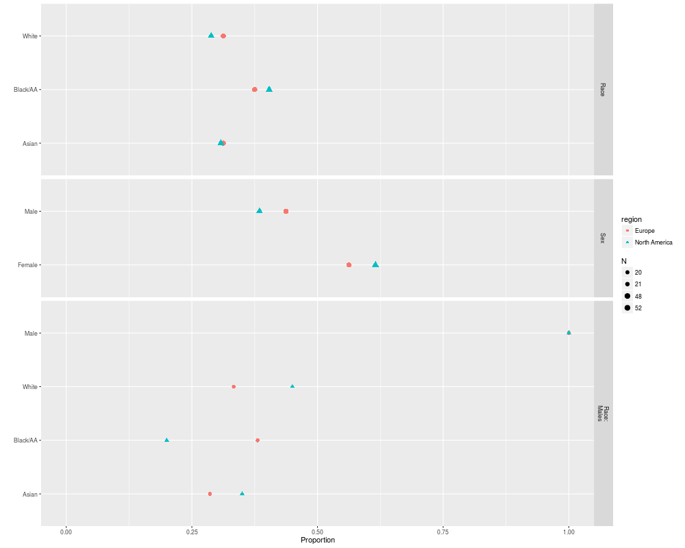
sb <- summaryP(race + sex +
pBlock(race, sex, label='Race: Males', subset=sex=='Male') ~
region, data=d)
plot(sb, text.at=1.3)
plot(sb, groups='region', layout=c(1,3), key=list(space='top'),
text.at=1.15)
ggplot(sb, groups='region')
## Not run:
plot(s, groups='treat')
# plot(s, groups='treat', outerlabels=FALSE) for standard lattice output
plot(s, groups='region', key=list(columns=2, space='bottom'))
colorFacet(ggplot(s))
plot(summaryP(race + sex ~ region, data=d), exclude1=FALSE, col='green')
# Make your own plot using data frame created by summaryP
useOuterStrips(dotplot(val ~ freq | region * var, groups=treat, data=s,
xlim=c(0,1), scales=list(y='free', rot=0), xlab='Fraction',
panel=function(x, y, subscripts, ...) {
denom <- s$denom[subscripts]
x <- x / denom
panel.dotplot(x=x, y=y, subscripts=subscripts, ...) }))
# Show marginal summary for all regions combined
s <- summaryP(race + sex ~ region, data=addMarginal(d, region))
plot(s, groups='region', key=list(space='top'), layout=c(1,2))
# Show marginal summaries for both race and sex
s <- summaryP(ynbind(x1, x2, x3, x4, label='Exclusions', sort=FALSE) ~
race + sex, data=addMarginal(d, race, sex))
plot(s, val ~ freq | sex*race)
## End(Not run)
Results
R version 3.3.1 (2016-06-21) -- "Bug in Your Hair"
Copyright (C) 2016 The R Foundation for Statistical Computing
Platform: x86_64-pc-linux-gnu (64-bit)
R is free software and comes with ABSOLUTELY NO WARRANTY.
You are welcome to redistribute it under certain conditions.
Type 'license()' or 'licence()' for distribution details.
R is a collaborative project with many contributors.
Type 'contributors()' for more information and
'citation()' on how to cite R or R packages in publications.
Type 'demo()' for some demos, 'help()' for on-line help, or
'help.start()' for an HTML browser interface to help.
Type 'q()' to quit R.
> library(Hmisc)
Loading required package: lattice
Loading required package: survival
Loading required package: Formula
Loading required package: ggplot2
Attaching package: 'Hmisc'
The following objects are masked from 'package:base':
format.pval, round.POSIXt, trunc.POSIXt, units
> png(filename="/home/ddbj/snapshot/RGM3/R_CC/result/Hmisc/summaryP.Rd_%03d_medium.png", width=480, height=480)
> ### Name: summaryP
> ### Title: Multi-way Summary of Proportions
> ### Aliases: summaryP plot.summaryP ggplot.summaryP latex.summaryP
> ### Keywords: hplot category manip
>
> ### ** Examples
>
> n <- 100
> f <- function(na=FALSE) {
+ x <- sample(c('N', 'Y'), n, TRUE)
+ if(na) x[runif(100) < .1] <- NA
+ x
+ }
> set.seed(1)
> d <- data.frame(x1=f(), x2=f(), x3=f(), x4=f(), x5=f(), x6=f(), x7=f(TRUE),
+ age=rnorm(n, 50, 10),
+ race=sample(c('Asian', 'Black/AA', 'White'), n, TRUE),
+ sex=sample(c('Female', 'Male'), n, TRUE),
+ treat=sample(c('A', 'B'), n, TRUE),
+ region=sample(c('North America','Europe'), n, TRUE))
> d <- upData(d, labels=c(x1='MI', x2='Stroke', x3='AKI', x4='Migraines',
+ x5='Pregnant', x6='Other event', x7='MD withdrawal',
+ race='Race', sex='Sex'))
Input object size: 12352 bytes; 12 variables 100 observations
New object size: 14832 bytes; 12 variables 100 observations
> dasna <- subset(d, region=='North America')
> with(dasna, table(race, treat))
treat
race A B
Asian 8 8
Black/AA 8 13
White 8 7
> s <- summaryP(race + sex + ynbind(x1, x2, x3, x4, x5, x6, x7, label='Exclusions') ~
+ region + treat, data=d)
> # add exclude1=FALSE below to include female category
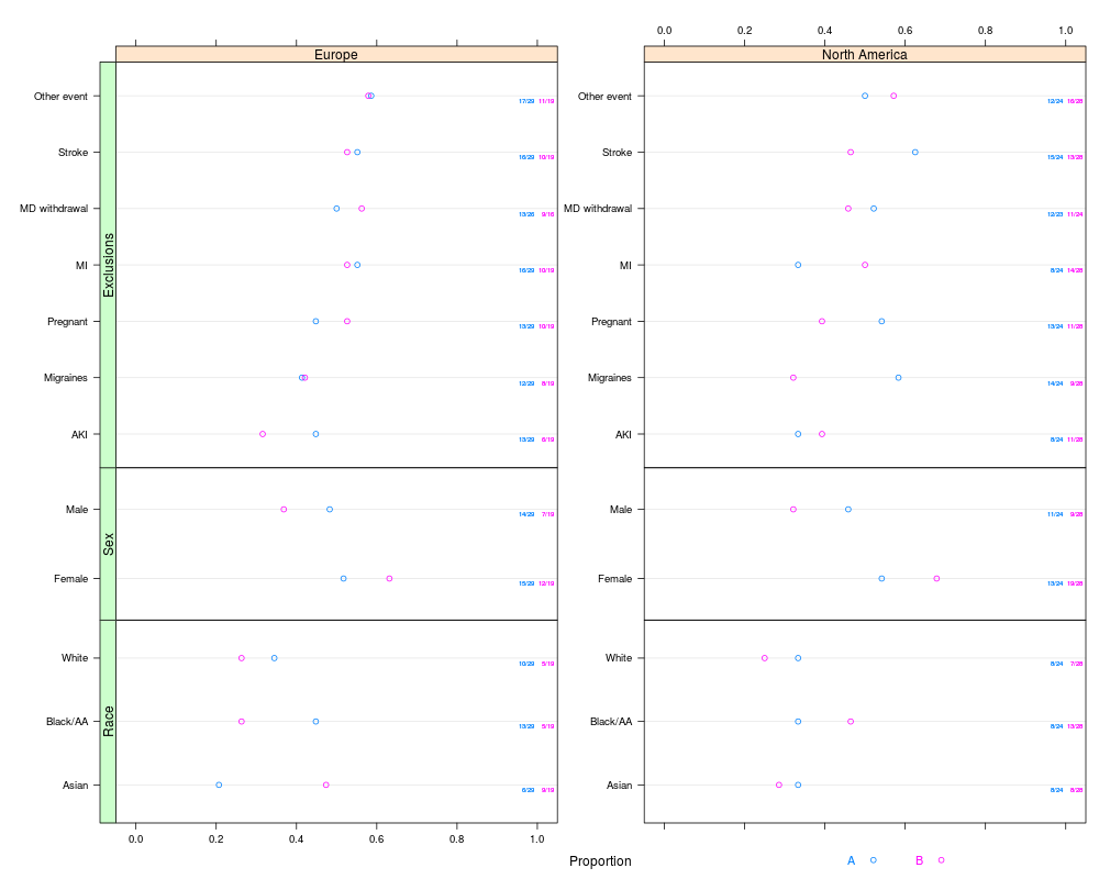
> plot(s, groups='treat')
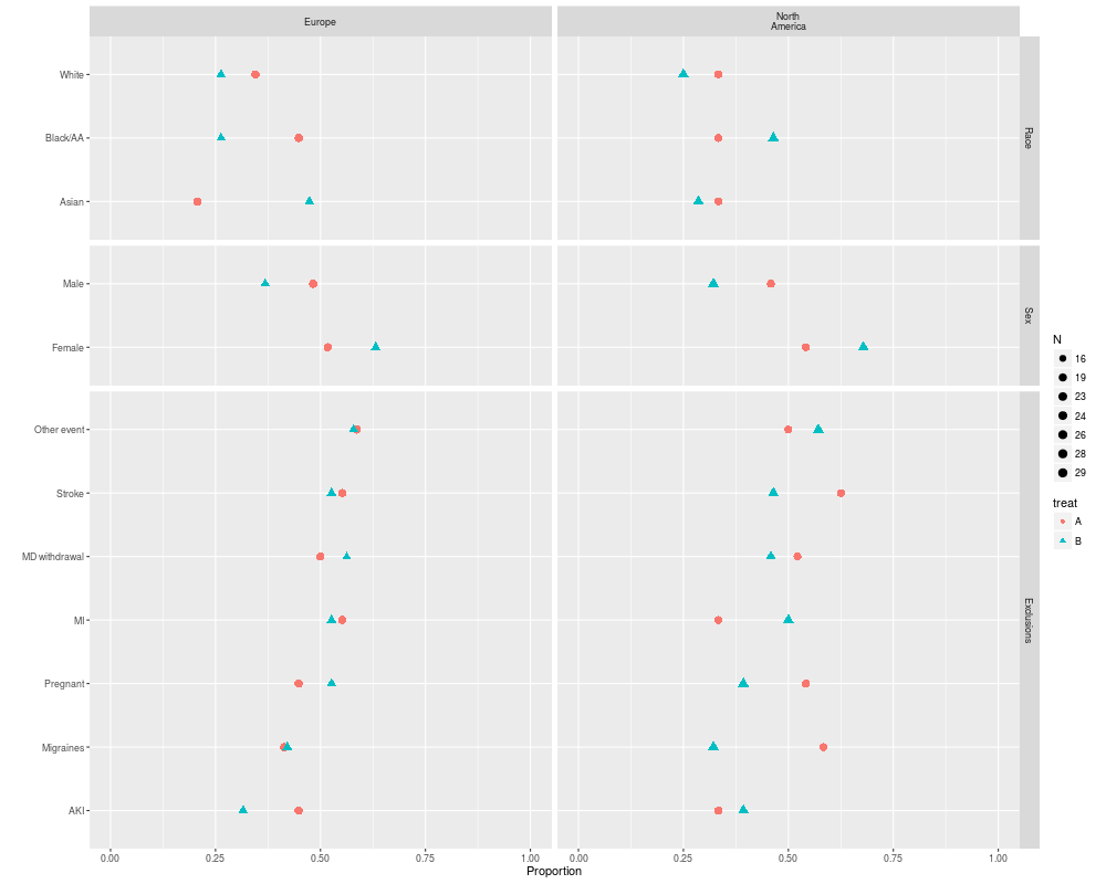
> ggplot(s, groups='treat')
>
> plot(s, val ~ freq | region * var, groups='treat', outerlabels=FALSE)
> # Much better looking if omit outerlabels=FALSE; see output at
> # http://biostat.mc.vanderbilt.edu/HmiscNew#summaryP
> # See more examples under bpplotM
>
> # Make a chart where there is a block of variables that
> # are only analyzed for males. Keep redundant sex in block for demo.
> # Leave extra space for numerators, denominators
> sb <- summaryP(race + sex +
+ pBlock(race, sex, label='Race: Males', subset=sex=='Male') ~
+ region, data=d)
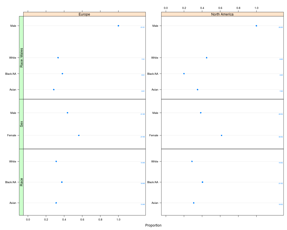
> plot(sb, text.at=1.3)
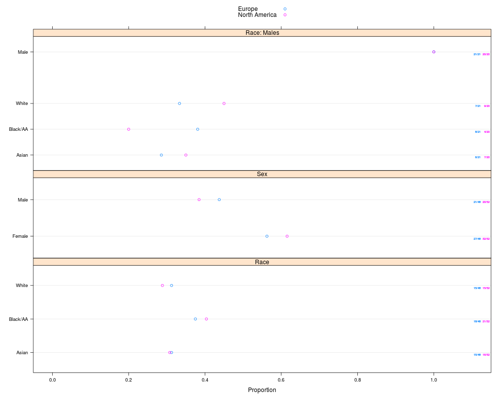
> plot(sb, groups='region', layout=c(1,3), key=list(space='top'),
+ text.at=1.15)
> ggplot(sb, groups='region')
> ## Not run:
> ##D plot(s, groups='treat')
> ##D # plot(s, groups='treat', outerlabels=FALSE) for standard lattice output
> ##D plot(s, groups='region', key=list(columns=2, space='bottom'))
> ##D colorFacet(ggplot(s))
> ##D
> ##D plot(summaryP(race + sex ~ region, data=d), exclude1=FALSE, col='green')
> ##D
> ##D # Make your own plot using data frame created by summaryP
> ##D useOuterStrips(dotplot(val ~ freq | region * var, groups=treat, data=s,
> ##D xlim=c(0,1), scales=list(y='free', rot=0), xlab='Fraction',
> ##D panel=function(x, y, subscripts, ...) {
> ##D denom <- s$denom[subscripts]
> ##D x <- x / denom
> ##D panel.dotplot(x=x, y=y, subscripts=subscripts, ...) }))
> ##D
> ##D # Show marginal summary for all regions combined
> ##D s <- summaryP(race + sex ~ region, data=addMarginal(d, region))
> ##D plot(s, groups='region', key=list(space='top'), layout=c(1,2))
> ##D
> ##D # Show marginal summaries for both race and sex
> ##D s <- summaryP(ynbind(x1, x2, x3, x4, label='Exclusions', sort=FALSE) ~
> ##D race + sex, data=addMarginal(d, race, sex))
> ##D plot(s, val ~ freq | sex*race)
> ## End(Not run)
>
>
>
>
>
> dev.off()
null device
1
>
|