Supported by Dr. Osamu Ogasawara and  . . |
|
Last data update: 2014.03.03 |
Summarize Multiple Response Variables and Make Multipanel Scatter or Dot PlotDescriptionMultiple left-hand formula variables along with right-hand side
conditioning variables are reshaped into a "tall and thin" data frame if
When
Usage
summaryS(formula, fun = NULL, data = NULL, subset = NULL,
         na.action = na.retain, continuous=10, ...)

## S3 method for class 'summaryS'
plot(x, formula=NULL, groups=NULL, panel=NULL,
           paneldoesgroups=FALSE, datadensity=NULL, ylab='',
           funlabel=NULL, textonly='n', textplot=NULL,
           digits=3, custom=NULL,
           xlim=NULL, ylim=NULL, cex.strip=1, cex.values=0.5, pch.stats=NULL,
           key=list(columns=length(groupslevels),
             x=.75, y=-.04, cex=.9,
             col=trellis.par.get('superpose.symbol')$col, corner=c(0,1)),
           outerlabels=TRUE, autoarrange=TRUE, scat1d.opts=NULL, ...)

mbarclPanel(x, y, subscripts, groups=NULL, yother, ...)

medvPanel(x, y, subscripts, groups=NULL, violin=TRUE, quantiles=FALSE, ...)
Arguments
Valuea data frame with added attributes for Author(s)Frank Harrell See Also
Examples
# See tests directory file summaryS.r for more examples
n <- 100
set.seed(1)
d <- data.frame(sbp=rnorm(n, 120, 10),
dbp=rnorm(n, 80, 10),
age=rnorm(n, 50, 10),
days=sample(1:n, n, TRUE),
S1=Surv(2*runif(n)), S2=Surv(runif(n)),
race=sample(c('Asian', 'Black/AA', 'White'), n, TRUE),
sex=sample(c('Female', 'Male'), n, TRUE),
treat=sample(c('A', 'B'), n, TRUE),
region=sample(c('North America','Europe'), n, TRUE),
meda=sample(0:1, n, TRUE), medb=sample(0:1, n, TRUE))
d <- upData(d, labels=c(sbp='Systolic BP', dbp='Diastolic BP',
race='Race', sex='Sex', treat='Treatment',
days='Time Since Randomization',
S1='Hospitalization', S2='Re-Operation',
meda='Medication A', medb='Medication B'),
units=c(sbp='mmHg', dbp='mmHg', age='Year', days='Days'))
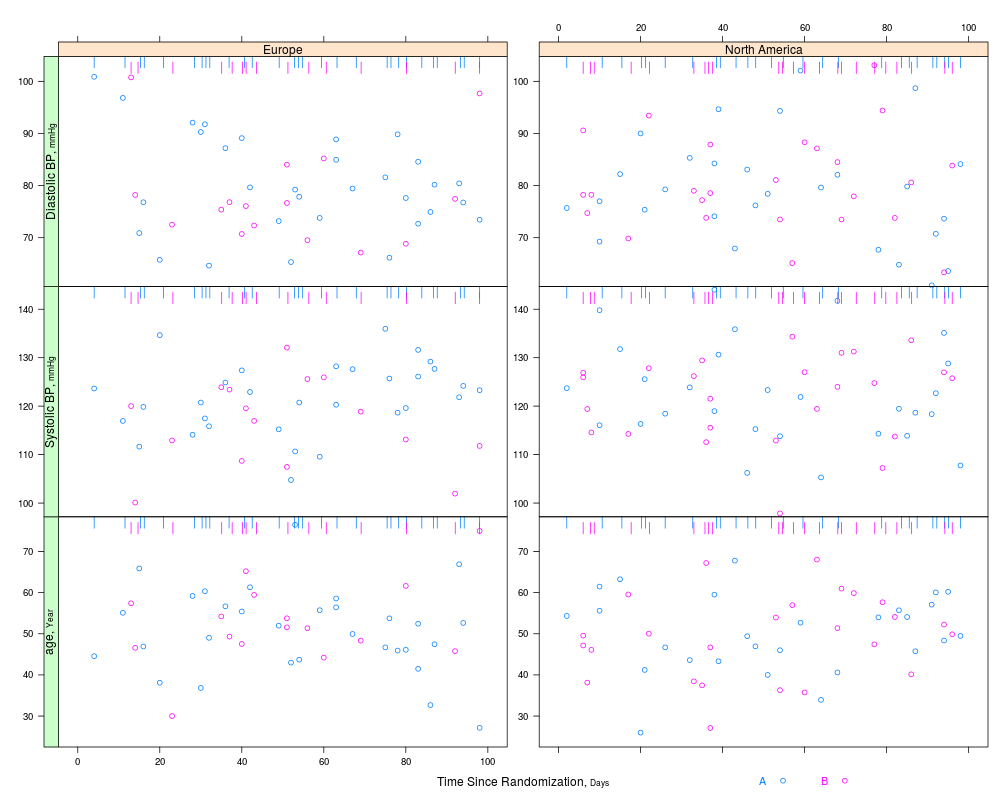
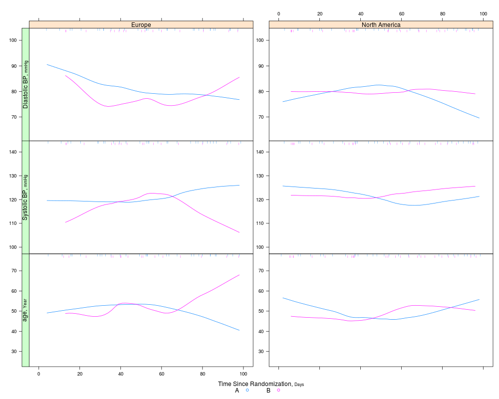
s <- summaryS(age + sbp + dbp ~ days + region + treat, data=d)
# plot(s) # 3 pages
plot(s, groups='treat', datadensity=TRUE,
scat1d.opts=list(lwd=.5, nhistSpike=0))
plot(s, groups='treat', panel=panel.loess, key=list(space='bottom', columns=2),
datadensity=TRUE, scat1d.opts=list(lwd=.5))
# Make your own plot using data frame created by summaryP
# xyplot(y ~ days | yvar * region, groups=treat, data=s,
# scales=list(y='free', rot=0))
# Use loess to estimate the probability of two different types of events as
# a function of time
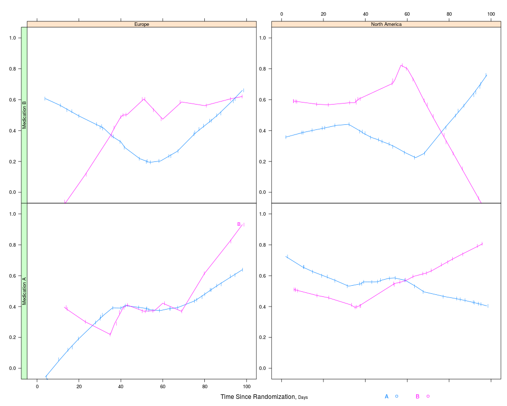
s <- summaryS(meda + medb ~ days + treat + region, data=d)
pan <- function(...)
panel.plsmo(..., type='l', label.curves=max(which.packet()) == 1,
datadensity=TRUE)
plot(s, groups='treat', panel=pan, paneldoesgroups=TRUE,
scat1d.opts=list(lwd=.7), cex.strip=.8)
# Demonstrate dot charts of summary statistics
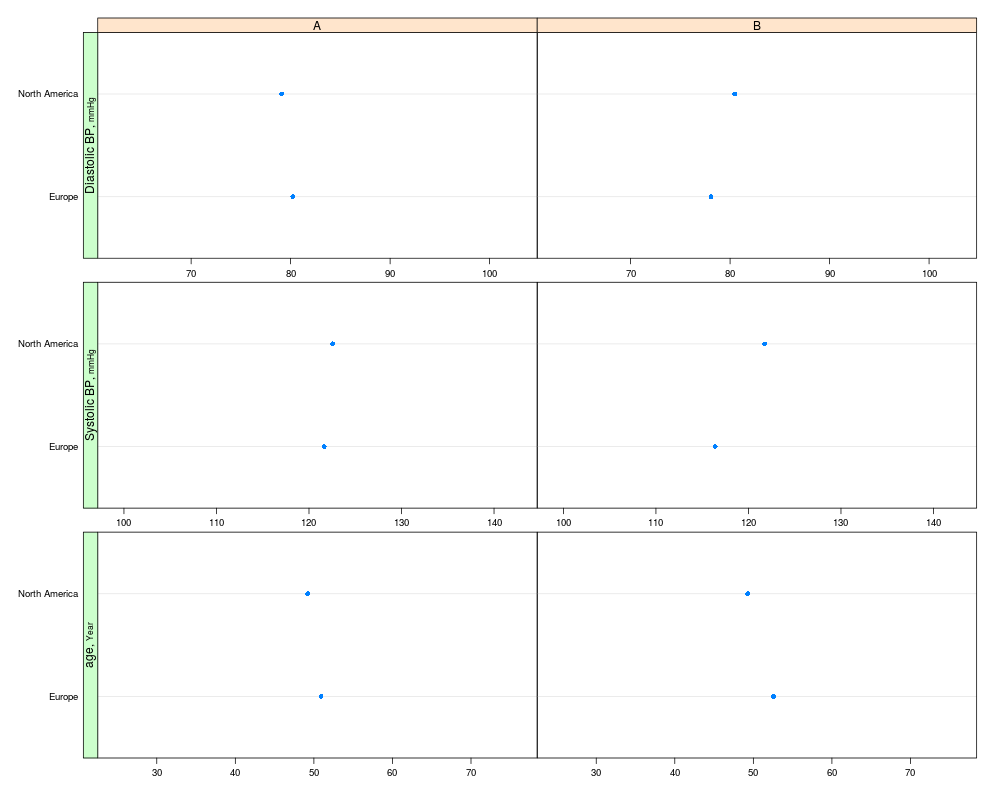
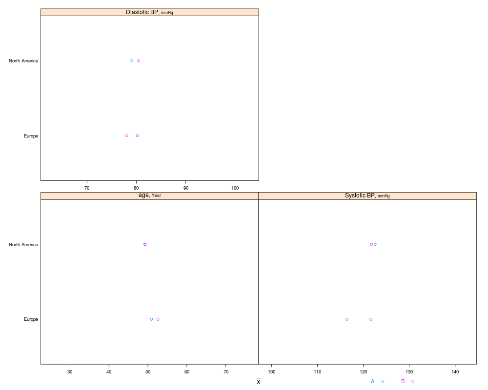
s <- summaryS(age + sbp + dbp ~ region + treat, data=d, fun=mean)
plot(s)
plot(s, groups='treat', funlabel=expression(bar(X)))
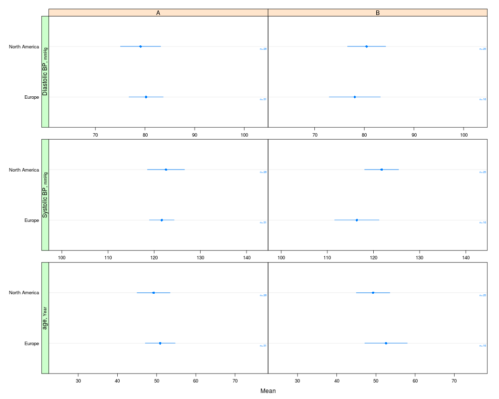
# Compute parametric confidence limits for mean, and include sample
# sizes by naming a column "n"
f <- function(x) {
x <- x[! is.na(x)]
c(smean.cl.normal(x, na.rm=FALSE), n=length(x))
}
s <- summaryS(age + sbp + dbp ~ region + treat, data=d, fun=f)
plot(s, funlabel=expression(bar(X) %+-% t[0.975] %*% s))
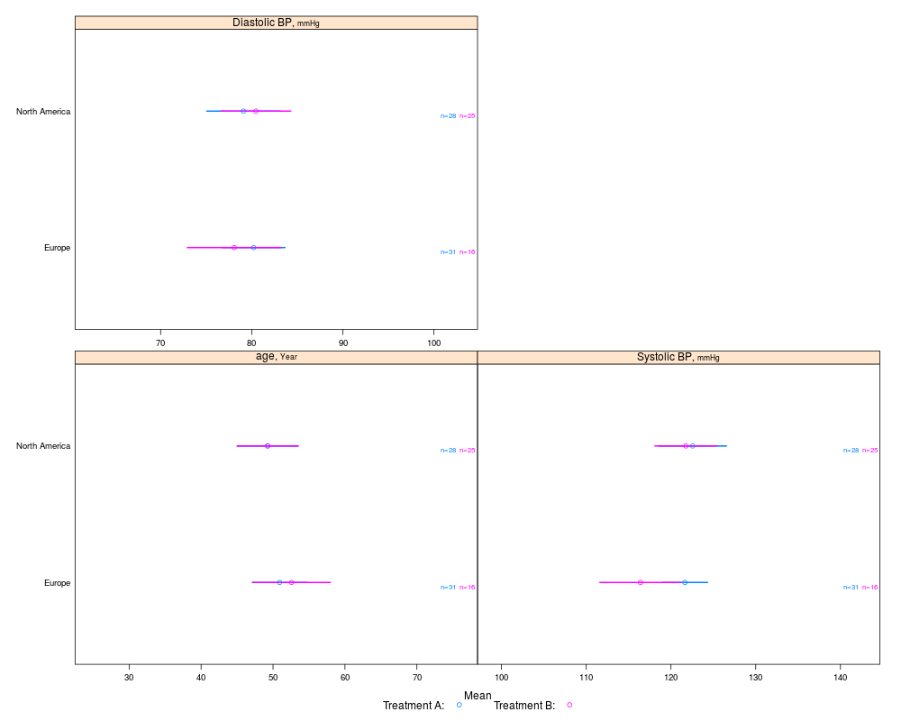
plot(s, groups='treat', cex.values=.65,
key=list(space='bottom', columns=2,
text=c('Treatment A:','Treatment B:')))
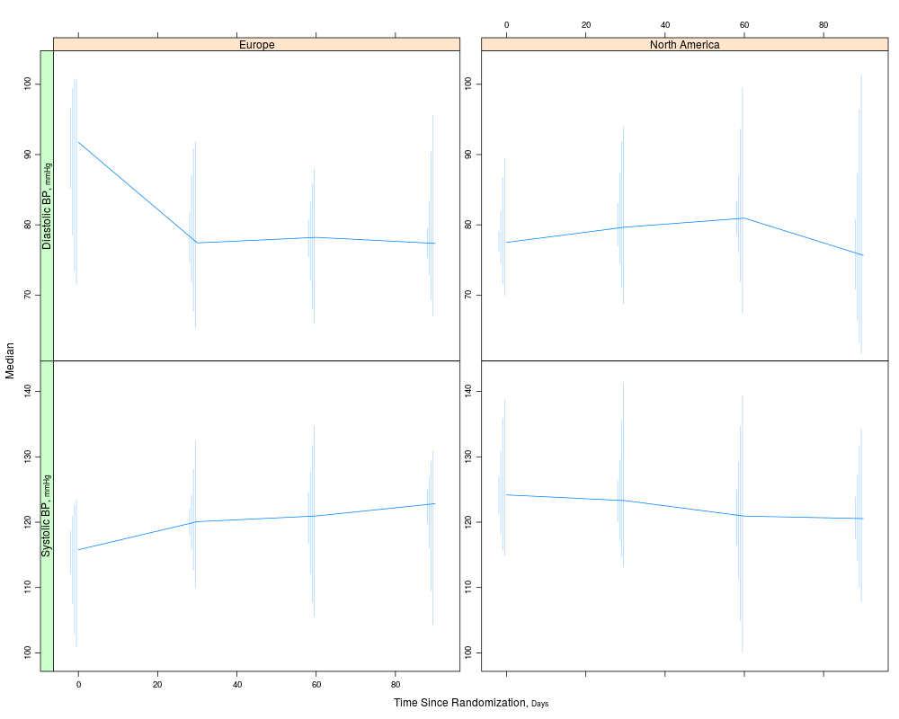
# For discrete time, plot Harrell-Davis quantiles of y variables across
# time using different line characteristics to distinguish quantiles
d <- upData(d, days=round(days / 30) * 30)
g <- function(y) {
probs <- c(0.05, 0.125, 0.25, 0.375)
probs <- sort(c(probs, 1 - probs))
y <- y[! is.na(y)]
w <- hdquantile(y, probs)
m <- hdquantile(y, 0.5, se=TRUE)
se <- as.numeric(attr(m, 'se'))
c(Median=as.numeric(m), w, se=se, n=length(y))
}
s <- summaryS(sbp + dbp ~ days + region, fun=g, data=d)
plot(s, panel=mbarclPanel)
plot(s, groups='region', panel=mbarclPanel, paneldoesgroups=TRUE)
# For discrete time, plot median y vs x along with CL for difference,
# using Harrell-Davis median estimator and its s.e., and use violin
# plots
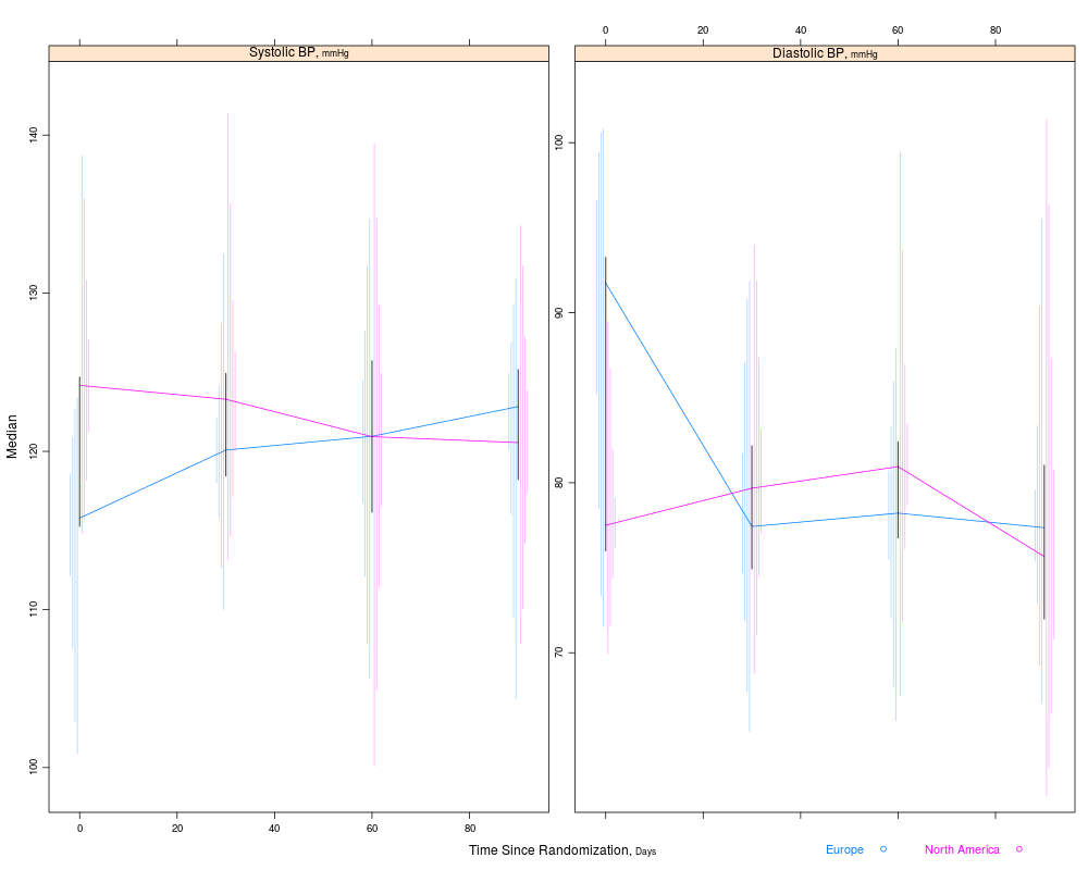
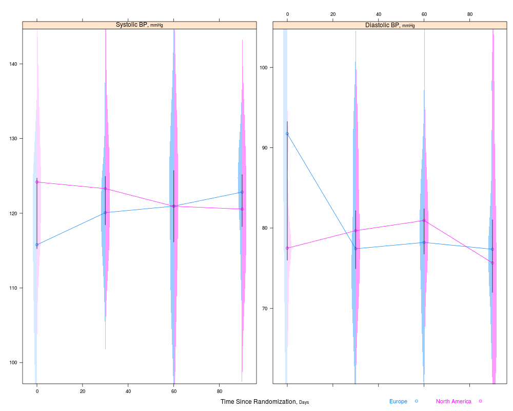
s <- summaryS(sbp + dbp ~ days + region, data=d)
plot(s, groups='region', panel=medvPanel, paneldoesgroups=TRUE)
# Proportions and Wilson confidence limits, plus approx. Gaussian
# based half/width confidence limits for difference in probabilities
g <- function(y) {
y <- y[!is.na(y)]
n <- length(y)
p <- mean(y)
se <- sqrt(p * (1. - p) / n)
structure(c(binconf(sum(y), n), se=se, n=n),
names=c('Proportion', 'Lower', 'Upper', 'se', 'n'))
}
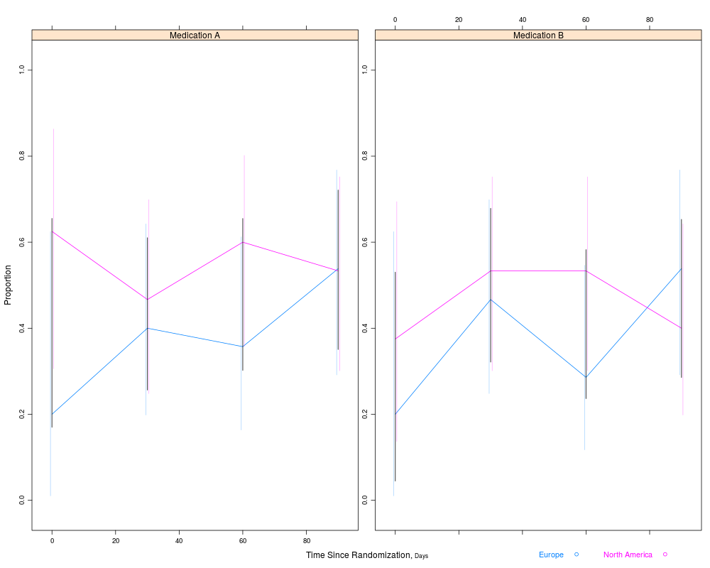
s <- summaryS(meda + medb ~ days + region, fun=g, data=d)
plot(s, groups='region', panel=mbarclPanel, paneldoesgroups=TRUE)
Results
R version 3.3.1 (2016-06-21) -- "Bug in Your Hair"
Copyright (C) 2016 The R Foundation for Statistical Computing
Platform: x86_64-pc-linux-gnu (64-bit)

R is free software and comes with ABSOLUTELY NO WARRANTY.
You are welcome to redistribute it under certain conditions.
Type 'license()' or 'licence()' for distribution details.

R is a collaborative project with many contributors.
Type 'contributors()' for more information and
'citation()' on how to cite R or R packages in publications.

Type 'demo()' for some demos, 'help()' for on-line help, or
'help.start()' for an HTML browser interface to help.
Type 'q()' to quit R.

> library(Hmisc)
Loading required package: lattice
Loading required package: survival
Loading required package: Formula
Loading required package: ggplot2

Attaching package: 'Hmisc'

The following objects are masked from 'package:base':

    format.pval, round.POSIXt, trunc.POSIXt, units

> png(filename="/home/ddbj/snapshot/RGM3/R_CC/result/Hmisc/summaryS.Rd_%03d_medium.png", width=480, height=480)
> ### Name: summaryS
> ### Title: Summarize Multiple Response Variables and Make Multipanel
> ###   Scatter or Dot Plot
> ### Aliases: summaryS plot.summaryS mbarclPanel medvPanel
> ### Keywords: category hplot manip grouping
>
> ### ** Examples
>
> # See tests directory file summaryS.r for more examples
> n <- 100
> set.seed(1)
> d <- data.frame(sbp=rnorm(n, 120, 10),
+                 dbp=rnorm(n, 80, 10),
+                 age=rnorm(n, 50, 10),
+                 days=sample(1:n, n, TRUE),
+                 S1=Surv(2*runif(n)), S2=Surv(runif(n)),
+                 race=sample(c('Asian', 'Black/AA', 'White'), n, TRUE),
+                 sex=sample(c('Female', 'Male'), n, TRUE),
+                 treat=sample(c('A', 'B'), n, TRUE),
+                 region=sample(c('North America','Europe'), n, TRUE),
+                 meda=sample(0:1, n, TRUE), medb=sample(0:1, n, TRUE))
>
> d <- upData(d, labels=c(sbp='Systolic BP', dbp='Diastolic BP',
+             race='Race', sex='Sex', treat='Treatment',
+             days='Time Since Randomization',
+             S1='Hospitalization', S2='Re-Operation',
+             meda='Medication A', medb='Medication B'),
+             units=c(sbp='mmHg', dbp='mmHg', age='Year', days='Days'))
Input object size:	 14040 bytes;	 12 variables	 100 observations
New object size:	 18712 bytes;	 12 variables	 100 observations
>
> s <- summaryS(age + sbp + dbp ~ days + region + treat,  data=d)
> # plot(s)   # 3 pages
> plot(s, groups='treat', datadensity=TRUE,
+      scat1d.opts=list(lwd=.5, nhistSpike=0))
> plot(s, groups='treat', panel=panel.loess, key=list(space='bottom', columns=2),
+      datadensity=TRUE, scat1d.opts=list(lwd=.5))
>
> # Make your own plot using data frame created by summaryP
> # xyplot(y ~ days | yvar * region, groups=treat, data=s,
> #        scales=list(y='free', rot=0))
>
> # Use loess to estimate the probability of two different types of events as
> # a function of time
> s <- summaryS(meda + medb ~ days + treat + region, data=d)
> pan <- function(...)
+    panel.plsmo(..., type='l', label.curves=max(which.packet()) == 1,
+                datadensity=TRUE)
> plot(s, groups='treat', panel=pan, paneldoesgroups=TRUE,
+      scat1d.opts=list(lwd=.7), cex.strip=.8)
>
> # Demonstrate dot charts of summary statistics
> s <- summaryS(age + sbp + dbp ~ region + treat, data=d, fun=mean)
> plot(s)
> plot(s, groups='treat', funlabel=expression(bar(X)))
> # Compute parametric confidence limits for mean, and include sample
> # sizes by naming a column "n"
>
> f <- function(x) {
+   x <- x[! is.na(x)]
+   c(smean.cl.normal(x, na.rm=FALSE), n=length(x))
+ }
> s <- summaryS(age + sbp + dbp ~ region + treat, data=d, fun=f)
> plot(s, funlabel=expression(bar(X) %+-% t[0.975] %*% s))
> plot(s, groups='treat', cex.values=.65,
+      key=list(space='bottom', columns=2,
+        text=c('Treatment A:','Treatment B:')))
>
> # For discrete time, plot Harrell-Davis quantiles of y variables across
> # time using different line characteristics to distinguish quantiles
> d <- upData(d, days=round(days / 30) * 30)
Input object size:	 18712 bytes;	 12 variables	 100 observations
Modified variable	 days
New object size:	 18712 bytes;	 12 variables	 100 observations
> g <- function(y) {
+   probs <- c(0.05, 0.125, 0.25, 0.375)
+   probs <- sort(c(probs, 1 - probs))
+   y <- y[! is.na(y)]
+   w <- hdquantile(y, probs)
+   m <- hdquantile(y, 0.5, se=TRUE)
+   se <- as.numeric(attr(m, 'se'))
+   c(Median=as.numeric(m), w, se=se, n=length(y))
+ }
> s <- summaryS(sbp + dbp ~ days + region, fun=g, data=d)
> plot(s, panel=mbarclPanel)
> plot(s, groups='region', panel=mbarclPanel, paneldoesgroups=TRUE)
>
> # For discrete time, plot median y vs x along with CL for difference,
> # using Harrell-Davis median estimator and its s.e., and use violin
> # plots
>
> s <- summaryS(sbp + dbp ~ days + region, data=d)
> plot(s, groups='region', panel=medvPanel, paneldoesgroups=TRUE)
>
> # Proportions and Wilson confidence limits, plus approx. Gaussian
> # based half/width confidence limits for difference in probabilities
> g <- function(y) {
+   y <- y[!is.na(y)]
+   n <- length(y)
+   p <- mean(y)
+   se <- sqrt(p * (1. - p) / n)
+   structure(c(binconf(sum(y), n), se=se, n=n),
+             names=c('Proportion', 'Lower', 'Upper', 'se', 'n'))
+ }
> s <- summaryS(meda + medb ~ days + region, fun=g, data=d)
> plot(s, groups='region', panel=mbarclPanel, paneldoesgroups=TRUE)
>
>
>
>
>
> dev.off()
null device
          1
>
|