Supported by Dr. Osamu Ogasawara and  . . |
|
Last data update: 2014.03.03 |
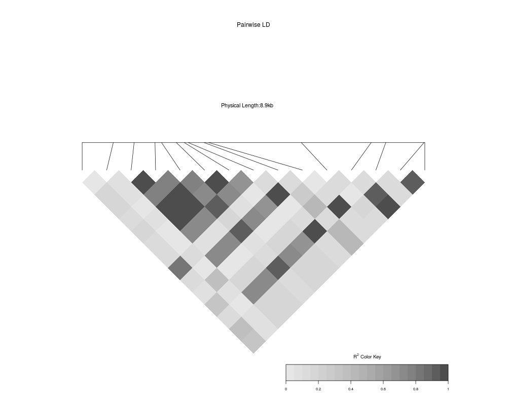
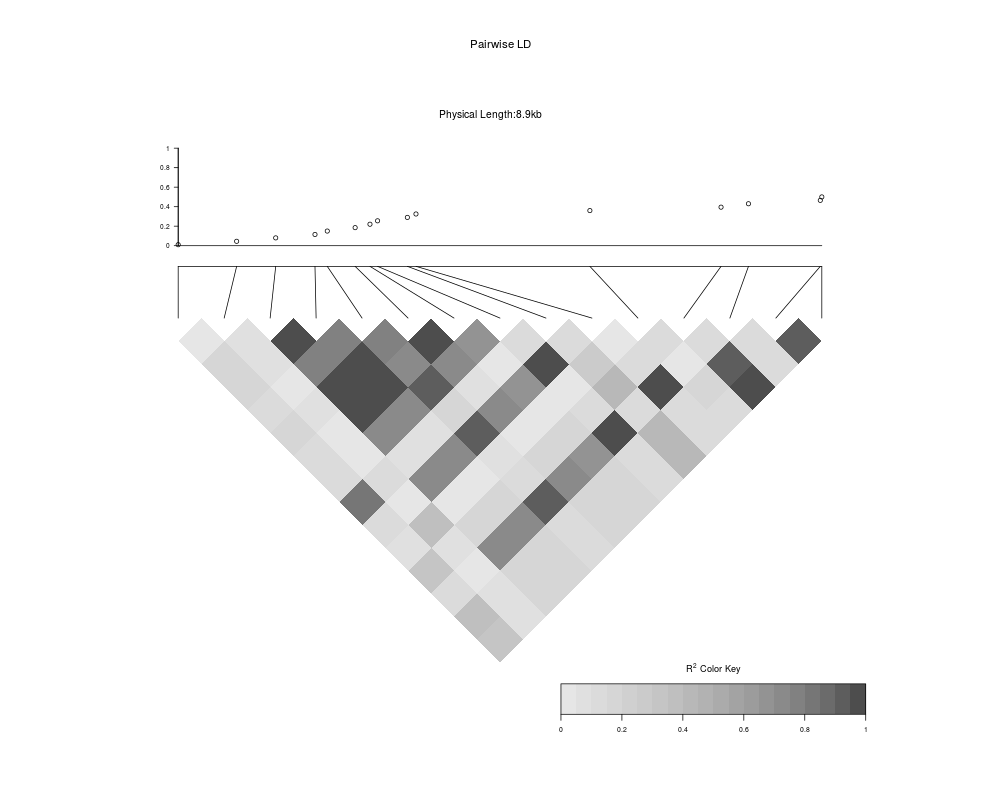
Add a scatter plot to an LDheatmap objectDescriptionAdd a scatter plot to an LDheatmap object. The x axis is the map of genetic distances of the SNPs. UsageLDheatmap.addScatterplot(LDheatmap, P, height = 0.2, ylab = NULL, ylim=NULL, type = "points") Arguments
DetailsThe function creates an ValueAn object of class LDheatmap given as an argument, with the Author(s)Sigal Blay <sblay@sfu.ca> and more See Also
Examples
# Load the package's data set
data("CEUData")
# Produce an LDheatmap object
MyLDheatmap <- LDheatmap(CEUSNP, genetic.distances = CEUDist, flip = TRUE)
# Generate an arbitrary vector of values to plot
Yvalues <- seq(length = length(MyLDheatmap$genetic.distances), from = 0.01, to = 0.5)
# Add scatter plot
assoc <- LDheatmap.addScatterplot(MyLDheatmap, Yvalues)
Results
R version 3.3.1 (2016-06-21) -- "Bug in Your Hair"
Copyright (C) 2016 The R Foundation for Statistical Computing
Platform: x86_64-pc-linux-gnu (64-bit)

R is free software and comes with ABSOLUTELY NO WARRANTY.
You are welcome to redistribute it under certain conditions.
Type 'license()' or 'licence()' for distribution details.

R is a collaborative project with many contributors.
Type 'contributors()' for more information and
'citation()' on how to cite R or R packages in publications.

Type 'demo()' for some demos, 'help()' for on-line help, or
'help.start()' for an HTML browser interface to help.
Type 'q()' to quit R.

> library(LDheatmap)
Loading required package: grid
> png(filename="/home/ddbj/snapshot/RGM3/R_CC/result/LDheatmap/LDheatmap.addScatterplot.Rd_%03d_medium.png", width=480, height=480)
> ### Name: LDheatmap.addScatterplot
> ### Title: Add a scatter plot to an LDheatmap object
> ### Aliases: LDheatmap.addScatterplot
> ### Keywords: hplot
>
> ### ** Examples
>
> # Load the package's data set
> data("CEUData")
> # Produce an LDheatmap object
> MyLDheatmap <- LDheatmap(CEUSNP, genetic.distances = CEUDist, flip = TRUE)
> # Generate an arbitrary vector of values to plot
> Yvalues <- seq(length = length(MyLDheatmap$genetic.distances), from = 0.01, to = 0.5)
> # Add scatter plot
> assoc <- LDheatmap.addScatterplot(MyLDheatmap, Yvalues)
>
>
>
>
>
> dev.off()
null device
          1
>
|
Created & Maintained by Osamu Ogasawara (osamu.ogasawara@gmail.com) and