Supported by Dr. Osamu Ogasawara and  . . |
|
Last data update: 2014.03.03 |
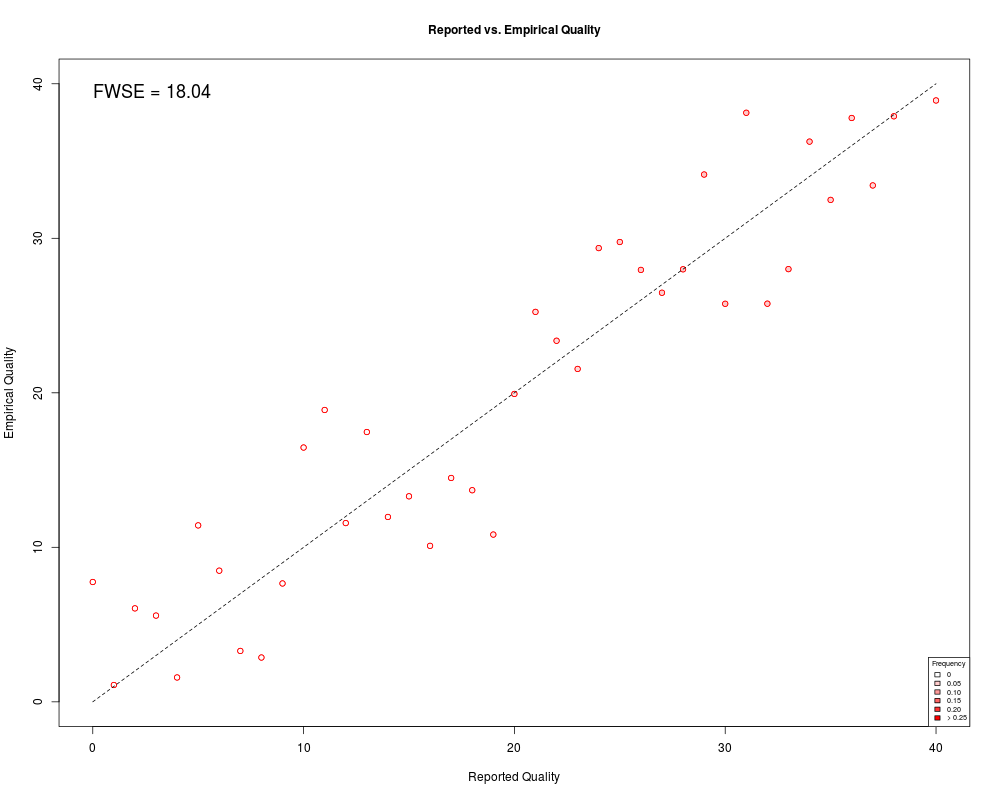
Plot reported vs. empirical quality.DescriptionPlots reported vs. empirical quality scores. Also calculates and outputs Frequency-Weighted Squared Error (FWSE) and reports FWSE on the plot. The points are shaded according to the relative frequency of bases assigned that quality score. UsageFWSEplot(ErrRates, QualFreq, FWSE_out = TRUE, col = "blue", max_freq = 0.25, lim = c(0, length(QualFreq) - 1), collegend = TRUE, xlabel = "Reported Quality", ylabel = "Empirical Quality", main_title = "Reported vs. Empirical Quality") Arguments
DetailsFWSEplot plots the reported quality score against the empirical quality score and reports FWSE. If the quality scores accurately reflect the probability of a sequencing error, then the points should fall close to the 45-degree line and FWSE should be close to zero. If the input vectors are $ErrRatesBefore and $QualFreqBefore from the ReQON output, this function will create the bottom left diagnostic plot that is output from ReQON. Similarly, if the input vectors are $ErrRatesAfter and $QualFreqAfter from ReQON output, then the bottom right diagnostic plot is created. For more details and interpretation, see the vignette by: browseVignettes("ReQON"). ValueIn addition to the plot, FWSEplot calculates and outputs Frequency-Weighted Squared Error (FWSE), a measure of how close the points lie to the 45-degree line. Author(s)Christopher Cabanski ccabansk@genome.wustl.edu Examples## Create relative frequency example data require( stats ) after <- dnorm( c( 0:40 ), mean = 30, sd = 8 ) after <- after / sum( after ) err_rate <- c( 0:40 ) + rnorm( 41, mean = 0, sd = 5) err_rate[ which( err_rate < 0 ) ] <- (-1) * err_rate[ which( err_rate < 0 ) ] ## to guarantee that all values are positive ## plot and calculate FWSE FWSEplot( err_rate, after, col = "red" ) Results
R version 3.3.1 (2016-06-21) -- "Bug in Your Hair"
Copyright (C) 2016 The R Foundation for Statistical Computing
Platform: x86_64-pc-linux-gnu (64-bit)

R is free software and comes with ABSOLUTELY NO WARRANTY.
You are welcome to redistribute it under certain conditions.
Type 'license()' or 'licence()' for distribution details.

R is a collaborative project with many contributors.
Type 'contributors()' for more information and
'citation()' on how to cite R or R packages in publications.

Type 'demo()' for some demos, 'help()' for on-line help, or
'help.start()' for an HTML browser interface to help.
Type 'q()' to quit R.

> library(ReQON)
Loading required package: Rsamtools
Loading required package: GenomeInfoDb
Loading required package: stats4
Loading required package: BiocGenerics
Loading required package: parallel

Attaching package: 'BiocGenerics'

The following objects are masked from 'package:parallel':

    clusterApply, clusterApplyLB, clusterCall, clusterEvalQ,
    clusterExport, clusterMap, parApply, parCapply, parLapply,
    parLapplyLB, parRapply, parSapply, parSapplyLB

The following objects are masked from 'package:stats':

    IQR, mad, xtabs

The following objects are masked from 'package:base':

    Filter, Find, Map, Position, Reduce, anyDuplicated, append,
    as.data.frame, cbind, colnames, do.call, duplicated, eval, evalq,
    get, grep, grepl, intersect, is.unsorted, lapply, lengths, mapply,
    match, mget, order, paste, pmax, pmax.int, pmin, pmin.int, rank,
    rbind, rownames, sapply, setdiff, sort, table, tapply, union,
    unique, unsplit

Loading required package: S4Vectors

Attaching package: 'S4Vectors'

The following objects are masked from 'package:base':

    colMeans, colSums, expand.grid, rowMeans, rowSums

Loading required package: IRanges
Loading required package: GenomicRanges
Loading required package: Biostrings
Loading required package: XVector
Loading required package: seqbias
> png(filename="/home/ddbj/snapshot/RGM3/R_BC/result/ReQON/FWSEplot.Rd_%03d_medium.png", width=480, height=480)
> ### Name: FWSEplot
> ### Title: Plot reported vs. empirical quality.
> ### Aliases: FWSEplot
>
> ### ** Examples
>
> ## Create relative frequency example data
> require( stats )
> after <- dnorm( c( 0:40 ), mean = 30, sd = 8 )
>   after <- after / sum( after )
> err_rate <- c( 0:40 ) + rnorm( 41, mean = 0, sd = 5)
>   err_rate[ which( err_rate < 0 ) ] <- (-1) * err_rate[ which( err_rate < 0 ) ]
>   ## to guarantee that all values are positive
>
> ## plot and calculate FWSE
> FWSEplot( err_rate, after, col = "red" )
[1] 26.05298
>
>
>
>
>
> dev.off()
null device
          1
>
|