Supported by Dr. Osamu Ogasawara and  . . |
|
Last data update: 2014.03.03 |
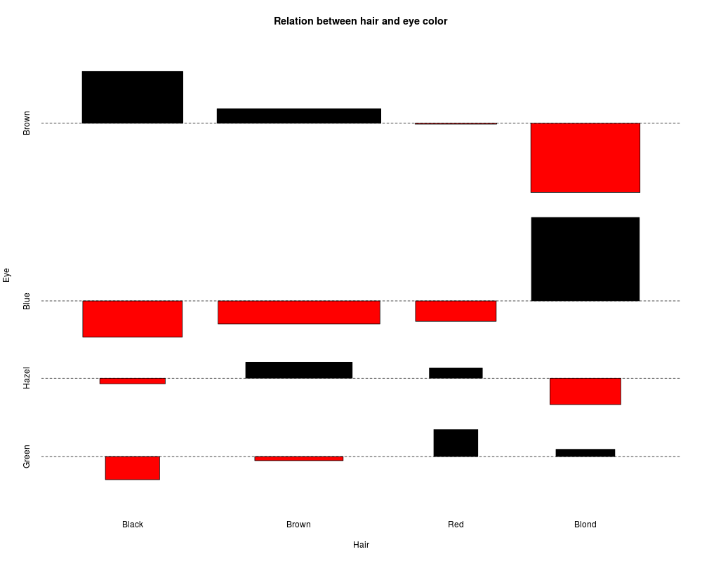
Association PlotsDescriptionProduce a Cohen-Friendly association plot indicating deviations from independence of rows and columns in a 2-dimensional contingency table. Usage
assocplot(x, col = c("black", "red"), space = 0.3,
          main = NULL, xlab = NULL, ylab = NULL)
Arguments
DetailsFor a two-way contingency table, the signed contribution to Pearson's
chi^2 for cell i, j is d_{ij} = (f_{ij} - e_{ij}) / sqrt(e_{ij}),
where f_{ij} and e_{ij} are the observed and expected
counts corresponding to the cell. In the Cohen-Friendly association
plot, each cell is represented by a rectangle that has (signed) height
proportional to d_{ij} and width proportional to
sqrt(e_{ij}), so that the area of the box is
proportional to the difference in observed and expected frequencies.
The rectangles in each row are positioned relative to a baseline
indicating independence (d_{ij} = 0). If the observed frequency
of a cell is greater than the expected one, the box rises above the
baseline and is shaded in the color specified by the first element of
A more flexible and extensible implementation of association plots
written in the grid graphics system is provided in the function
ReferencesCohen, A. (1980), On the graphical display of the significant components in a two-way contingency table. Communications in Statistics—Theory and Methods, A9, 1025–1041. Friendly, M. (1992), Graphical methods for categorical data. SAS User Group International Conference Proceedings, 17, 190–200. http://www.math.yorku.ca/SCS/sugi/sugi17-paper.html Meyer, D., Zeileis, A., and Hornik, K. (2005) The strucplot framework: Visualizing multi-way contingency tables with vcd. Report 22, Department of Statistics and Mathematics, Wirtschaftsuniversität Wien, Research Report Series. http://epub.wu.ac.at/dyn/openURL?id=oai:epub.wu-wien.ac.at:epub-wu-01_8a1 See Also
Examples## Aggregate over sex: x <- margin.table(HairEyeColor, c(1, 2)) x assocplot(x, main = "Relation between hair and eye color") Results
R version 3.3.1 (2016-06-21) -- "Bug in Your Hair"
Copyright (C) 2016 The R Foundation for Statistical Computing
Platform: x86_64-pc-linux-gnu (64-bit)

R is free software and comes with ABSOLUTELY NO WARRANTY.
You are welcome to redistribute it under certain conditions.
Type 'license()' or 'licence()' for distribution details.

R is a collaborative project with many contributors.
Type 'contributors()' for more information and
'citation()' on how to cite R or R packages in publications.

Type 'demo()' for some demos, 'help()' for on-line help, or
'help.start()' for an HTML browser interface to help.
Type 'q()' to quit R.

> library(graphics)
> png(filename="/home/ddbj/snapshot/RGM3/R_rel/result/graphics/assocplot.Rd_%03d_medium.png", width=480, height=480)
> ### Name: assocplot
> ### Title: Association Plots
> ### Aliases: assocplot
> ### Keywords: hplot
>
> ### ** Examples
>
> ## Aggregate over sex:
> x <- margin.table(HairEyeColor, c(1, 2))
> x
       Eye
Hair    Brown Blue Hazel Green
  Black    68   20    15     5
  Brown   119   84    54    29
  Red      26   17    14    14
  Blond     7   94    10    16
> assocplot(x, main = "Relation between hair and eye color")
>
>
>
>
>
> dev.off()
null device
          1
>
|