Creates a grid of colored or gray-scale rectangles with colors
corresponding to the values in z. This can be used to display
three-dimensional or spatial data aka images.
This is a generic function.
The functions heat.colors, terrain.colors
and topo.colors create heat-spectrum (red to white) and
topographical color schemes suitable for displaying ordered data, with
n giving the number of colors desired.
locations of grid lines at which the values in z are
measured. These must be finite, non-missing and in (strictly)
ascending order. By default, equally
spaced values from 0 to 1 are used. If x is a list,
its components x$x and x$y are used for x
and y, respectively. If the list has component z this
is used for z.
z
a numeric or logical matrix containing the values to be plotted
(NAs are allowed). Note that x can be used instead
of z for convenience.
zlim
the minimum and maximum z values for which colors
should be plotted, defaulting to the range of the finite values of
z. Each of the given colors will be used to color an
equispaced interval of this range. The midpoints of the
intervals cover the range, so that values just outside the range
will be plotted.
xlim, ylim
ranges for the plotted x and y values,
defaulting to the ranges of x and y.
col
a list of colors such as that generated by
rainbow, heat.colors,
topo.colors, terrain.colors or similar
functions.
add
logical; if TRUE, add to current plot (and disregard
the following four arguments). This is rarely useful because
image ‘paints’ over existing graphics.
xaxs, yaxs
style of x and y axis. The default "i" is
appropriate for images. See par.
xlab, ylab
each a character string giving the labels for the x and
y axis. Default to the ‘call names’ of x or y, or to
"" if these were unspecified.
breaks
a set of finite numeric breakpoints for the colours:
must have one more breakpoint than colour and be in increasing
order. Unsorted vectors will be sorted, with a warning.
oldstyle
logical. If true the midpoints of the colour intervals
are equally spaced, and zlim[1] and zlim[2] were taken
to be midpoints. The default is to have colour intervals of equal
lengths between the limits.
useRaster
logical; if TRUE a bitmap raster is used to
plot the image instead of polygons. The grid must be regular in that
case, otherwise an error is raised. For the behaviour when this is
not specified, see ‘Details’.
...
graphical parameters for plot may also be
passed as arguments to this function, as can the plot aspect ratio
asp and axes (see plot.window).
Details
The length of x should be equal to the nrow(z)+1 or
nrow(z). In the first case x specifies the boundaries
between the cells: in the second case x specifies the midpoints
of the cells. Similar reasoning applies to y. It probably
only makes sense to specify the midpoints of an equally-spaced
grid. If you specify just one row or column and a length-one x
or y, the whole user area in the corresponding direction is
filled. For logarithmic x or y axes the boundaries between
cells must be specified.
Rectangles corresponding to missing values are not plotted (and so are
transparent and (unless add = TRUE) the default background
painted in par("bg") will show though and if that is
transparent, the canvas colour will be seen).
If breaks is specified then zlim is unused and the
algorithm used follows cut, so intervals are closed on
the right and open on the left except for the lowest interval which is
closed at both ends.
The axes (where plotted) make use of the classes of xlim and
ylim (and hence by default the classes of x and
y): this will mean that for example dates are labelled as
such. (As from R 3.0.1.)
Notice that image interprets the z matrix as a table of
f(x[i], y[j]) values, so that the x axis corresponds to row
number and the y axis to column number, with column 1 at the bottom,
i.e. a 90 degree counter-clockwise rotation of the conventional
printed layout of a matrix.
Images for large z on a regular grid are rendered more
efficiently with useRaster = TRUE and can prevent rare
anti-aliasing artifacts, but may not be supported by all graphics
devices. Some devices (such as postscript and X11(type =
"Xlib")) which do not support semi-transparent colours may emit
missing values as white rather than transparent, and there may be
limitations on the size of a raster image. (Problems with the
rendering of raster images have been reported by users of
windows() devices under Remote Desktop, at least under its
default settings.)
The graphics files in PDF and PostScript can be much smaller under
this option.
If useRaster is not specified, raster images are used when the
getOption("preferRaster") is true, the grid is regular
and either dev.capabilities("rasterImage")$rasterImage
is "yes" or it is "non-missing" and there are no missing
values.
Note
Originally based on a function by Thomas Lumley.
See Also
filled.contour or heatmap which can
look nicer (but are less modular),
contour;
The lattice equivalent of image is
levelplot.
dev.capabilities to see if useRaster = TRUE is
supported on the current device.
Examples
require(grDevices) # for colours
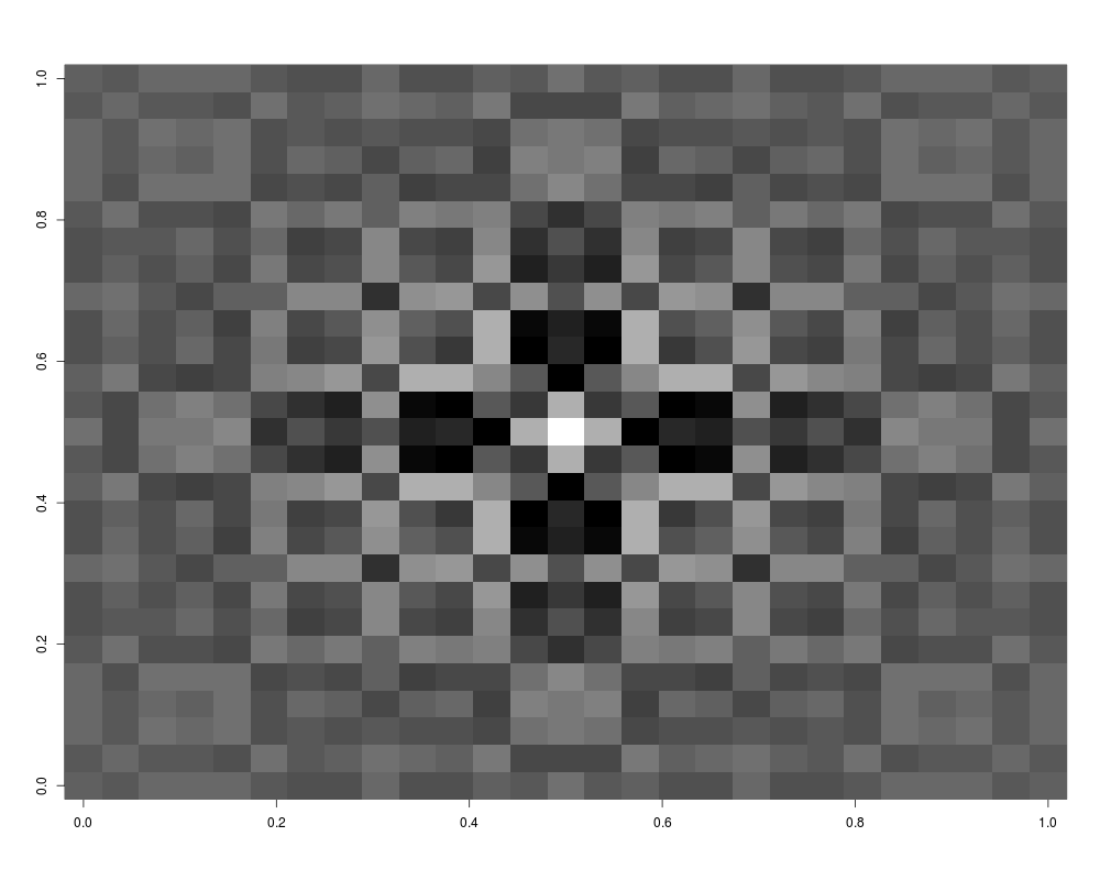
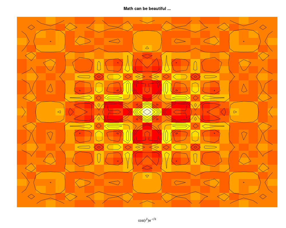
x <- y <- seq(-4*pi, 4*pi, len = 27)
r <- sqrt(outer(x^2, y^2, "+"))
image(z = z <- cos(r^2)*exp(-r/6), col = gray((0:32)/32))
image(z, axes = FALSE, main = "Math can be beautiful ...",
xlab = expression(cos(r^2) * e^{-r/6}))
contour(z, add = TRUE, drawlabels = FALSE)
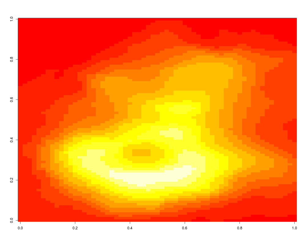
# Volcano data visualized as matrix. Need to transpose and flip
# matrix horizontally.
image(t(volcano)[ncol(volcano):1,])
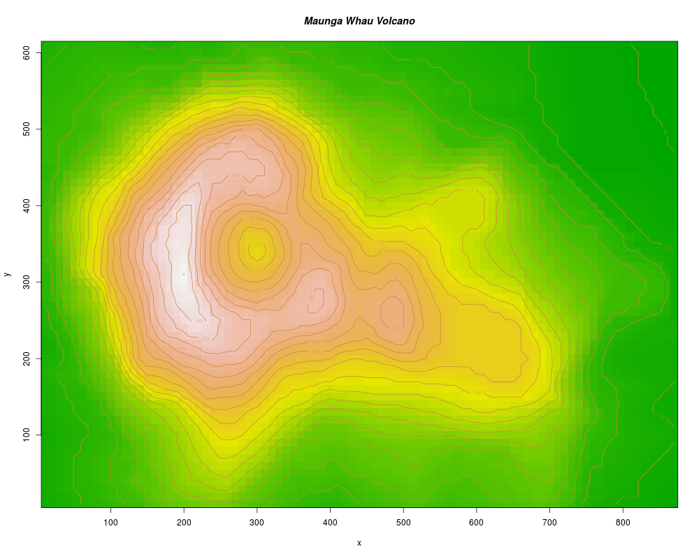
# A prettier display of the volcano
x <- 10*(1:nrow(volcano))
y <- 10*(1:ncol(volcano))
image(x, y, volcano, col = terrain.colors(100), axes = FALSE)
contour(x, y, volcano, levels = seq(90, 200, by = 5),
add = TRUE, col = "peru")
axis(1, at = seq(100, 800, by = 100))
axis(2, at = seq(100, 600, by = 100))
box()
title(main = "Maunga Whau Volcano", font.main = 4)
Results
R version 3.3.1 (2016-06-21) -- "Bug in Your Hair"
Copyright (C) 2016 The R Foundation for Statistical Computing
Platform: x86_64-pc-linux-gnu (64-bit)

R is free software and comes with ABSOLUTELY NO WARRANTY.
You are welcome to redistribute it under certain conditions.
Type 'license()' or 'licence()' for distribution details.

R is a collaborative project with many contributors.
Type 'contributors()' for more information and
'citation()' on how to cite R or R packages in publications.

Type 'demo()' for some demos, 'help()' for on-line help, or
'help.start()' for an HTML browser interface to help.
Type 'q()' to quit R.

> library(graphics)
> png(filename="/home/ddbj/snapshot/RGM3/R_rel/result/graphics/image.Rd_%03d_medium.png", width=480, height=480)
> ### Name: image
> ### Title: Display a Color Image
> ### Aliases: image image.default
> ### Keywords: hplot aplot
>
> ### ** Examples
>
> require(grDevices) # for colours
> x <- y <- seq(-4*pi, 4*pi, len = 27)
> r <- sqrt(outer(x^2, y^2, "+"))
> image(z = z <- cos(r^2)*exp(-r/6), col  = gray((0:32)/32))
> image(z, axes = FALSE, main = "Math can be beautiful ...",
+       xlab = expression(cos(r^2) * e^{-r/6}))
> contour(z, add = TRUE, drawlabels = FALSE)
>
> # Volcano data visualized as matrix. Need to transpose and flip
> # matrix horizontally.
> image(t(volcano)[ncol(volcano):1,])
>
> # A prettier display of the volcano
> x <- 10*(1:nrow(volcano))
> y <- 10*(1:ncol(volcano))
> image(x, y, volcano, col = terrain.colors(100), axes = FALSE)
> contour(x, y, volcano, levels = seq(90, 200, by = 5),
+         add = TRUE, col = "peru")
> axis(1, at = seq(100, 800, by = 100))
> axis(2, at = seq(100, 600, by = 100))
> box()
> title(main = "Maunga Whau Volcano", font.main = 4)
>
>
>
>
>
> dev.off()
null device
          1
>
 .
.