Supported by Dr. Osamu Ogasawara and  . . |
|
Last data update: 2014.03.03 |
Spine Plots and SpinogramsDescriptionSpine plots are a special cases of mosaic plots, and can be seen as a generalization of stacked (or highlighted) bar plots. Analogously, spinograms are an extension of histograms. Usage
spineplot(x, ...)

## Default S3 method:
spineplot(x, y = NULL,
          breaks = NULL, tol.ylab = 0.05, off = NULL,
          ylevels = NULL, col = NULL,
          main = "", xlab = NULL, ylab = NULL,
          xaxlabels = NULL, yaxlabels = NULL,
          xlim = NULL, ylim = c(0, 1), axes = TRUE, ...)

## S3 method for class 'formula'
spineplot(formula, data = NULL,
          breaks = NULL, tol.ylab = 0.05, off = NULL,
          ylevels = NULL, col = NULL,
          main = "", xlab = NULL, ylab = NULL,
          xaxlabels = NULL, yaxlabels = NULL,
          xlim = NULL, ylim = c(0, 1), axes = TRUE, ...,
          subset = NULL)
Arguments
Details
Both, spine plots and spinograms, are essentially mosaic plots with
special formatting of spacing and shading. Conceptually, they plot
P(y | x) against P(x). For the spine plot (where both
x and y are categorical), both quantities are approximated
by the corresponding empirical relative frequencies. For the
spinogram (where x is numerical), x is first discretized
(by calling Thus, spine plots can also be seen as a generalization of stacked bar
plots where not the heights but the widths of the bars corresponds to
the relative frequencies of ValueThe table visualized is returned invisibly. Author(s)Achim Zeileis Achim.Zeileis@R-project.org ReferencesFriendly, M. (1994), Mosaic displays for multi-way contingency tables. Journal of the American Statistical Association, 89, 190–200. Hartigan, J.A., and Kleiner, B. (1984), A mosaic of television ratings. The American Statistician, 38, 32–35. Hofmann, H., Theus, M. (2005), Interactive graphics for visualizing conditional distributions, Unpublished Manuscript. Hummel, J. (1996), Linked bar charts: Analysing categorical data graphically. Computational Statistics, 11, 23–33. See Also
Examples
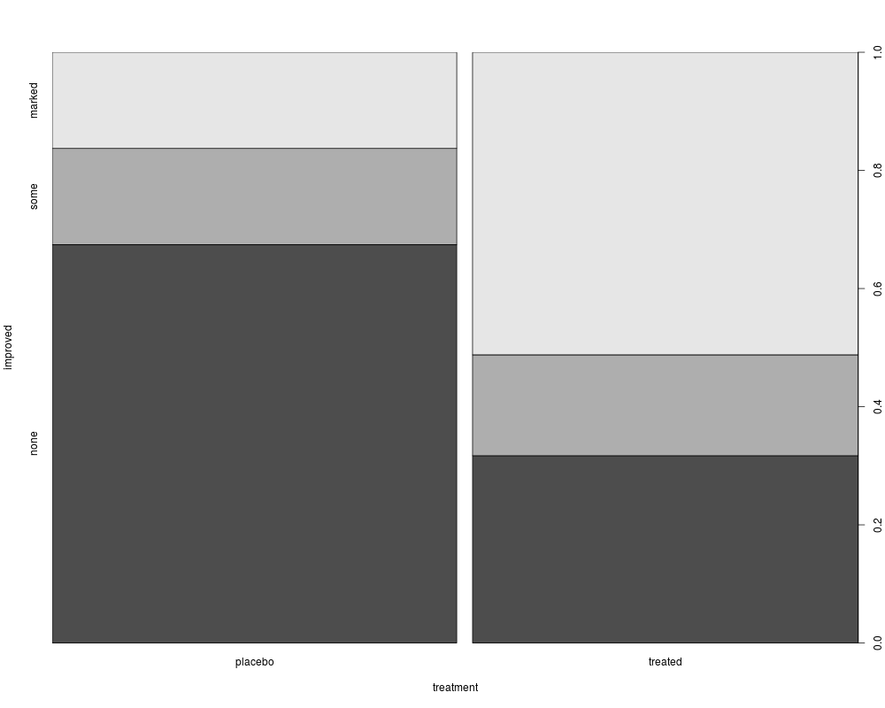
## treatment and improvement of patients with rheumatoid arthritis
treatment <- factor(rep(c(1, 2), c(43, 41)), levels = c(1, 2),
labels = c("placebo", "treated"))
improved <- factor(rep(c(1, 2, 3, 1, 2, 3), c(29, 7, 7, 13, 7, 21)),
levels = c(1, 2, 3),
labels = c("none", "some", "marked"))
## (dependence on a categorical variable)
(spineplot(improved ~ treatment))
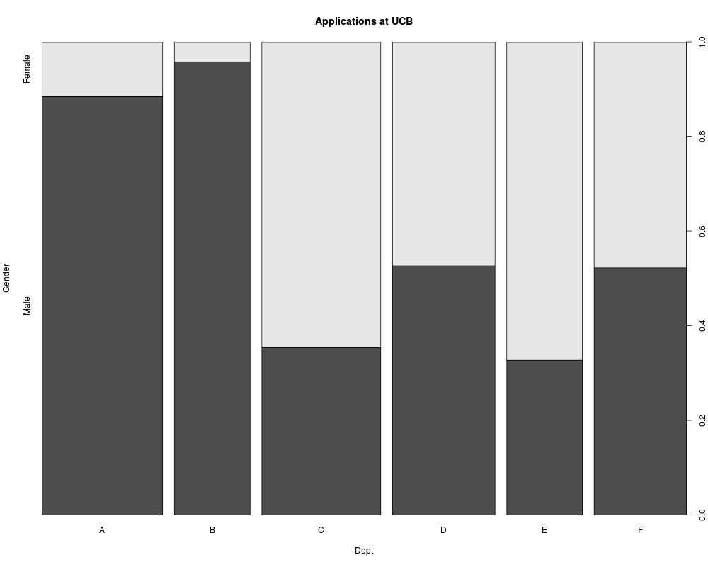
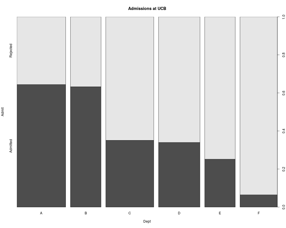
## applications and admissions by department at UC Berkeley
## (two-way tables)
(spineplot(margin.table(UCBAdmissions, c(3, 2)),
main = "Applications at UCB"))
(spineplot(margin.table(UCBAdmissions, c(3, 1)),
main = "Admissions at UCB"))
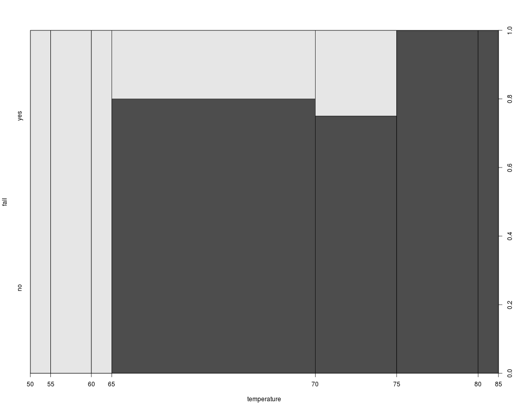
## NASA space shuttle o-ring failures
fail <- factor(c(2, 2, 2, 2, 1, 1, 1, 1, 1, 1, 2, 1, 2, 1,
1, 1, 1, 2, 1, 1, 1, 1, 1),
levels = c(1, 2), labels = c("no", "yes"))
temperature <- c(53, 57, 58, 63, 66, 67, 67, 67, 68, 69, 70, 70,
70, 70, 72, 73, 75, 75, 76, 76, 78, 79, 81)
## (dependence on a numerical variable)
(spineplot(fail ~ temperature))
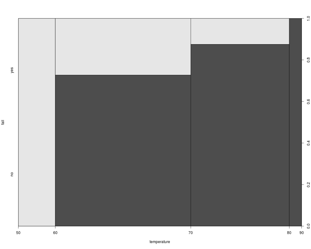
(spineplot(fail ~ temperature, breaks = 3))
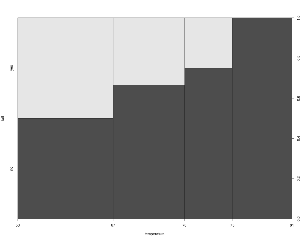
(spineplot(fail ~ temperature, breaks = quantile(temperature)))
## highlighting for failures
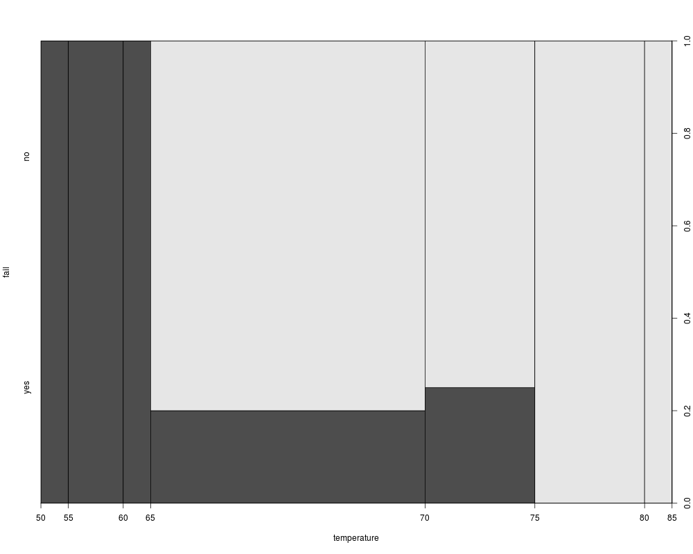
spineplot(fail ~ temperature, ylevels = 2:1)
Results
R version 3.3.1 (2016-06-21) -- "Bug in Your Hair"
Copyright (C) 2016 The R Foundation for Statistical Computing
Platform: x86_64-pc-linux-gnu (64-bit)

R is free software and comes with ABSOLUTELY NO WARRANTY.
You are welcome to redistribute it under certain conditions.
Type 'license()' or 'licence()' for distribution details.

R is a collaborative project with many contributors.
Type 'contributors()' for more information and
'citation()' on how to cite R or R packages in publications.

Type 'demo()' for some demos, 'help()' for on-line help, or
'help.start()' for an HTML browser interface to help.
Type 'q()' to quit R.

> library(graphics)
> png(filename="/home/ddbj/snapshot/RGM3/R_rel/result/graphics/spineplot.Rd_%03d_medium.png", width=480, height=480)
> ### Name: spineplot
> ### Title: Spine Plots and Spinograms
> ### Aliases: spineplot spineplot.default spineplot.formula
> ### Keywords: hplot
>
> ### ** Examples
>
> ## treatment and improvement of patients with rheumatoid arthritis
> treatment <- factor(rep(c(1, 2), c(43, 41)), levels = c(1, 2),
+                     labels = c("placebo", "treated"))
> improved <- factor(rep(c(1, 2, 3, 1, 2, 3), c(29, 7, 7, 13, 7, 21)),
+                    levels = c(1, 2, 3),
+                    labels = c("none", "some", "marked"))
>
> ## (dependence on a categorical variable)
> (spineplot(improved ~ treatment))
         improved
treatment none some marked
  placebo   29    7      7
  treated   13    7     21
>
> ## applications and admissions by department at UC Berkeley
> ## (two-way tables)
> (spineplot(margin.table(UCBAdmissions, c(3, 2)),
+            main = "Applications at UCB"))
    Gender
Dept Male Female
   A  825    108
   B  560     25
   C  325    593
   D  417    375
   E  191    393
   F  373    341
> (spineplot(margin.table(UCBAdmissions, c(3, 1)),
+            main = "Admissions at UCB"))
    Admit
Dept Admitted Rejected
   A      601      332
   B      370      215
   C      322      596
   D      269      523
   E      147      437
   F       46      668
>
> ## NASA space shuttle o-ring failures
> fail <- factor(c(2, 2, 2, 2, 1, 1, 1, 1, 1, 1, 2, 1, 2, 1,
+                  1, 1, 1, 2, 1, 1, 1, 1, 1),
+                levels = c(1, 2), labels = c("no", "yes"))
> temperature <- c(53, 57, 58, 63, 66, 67, 67, 67, 68, 69, 70, 70,
+                  70, 70, 72, 73, 75, 75, 76, 76, 78, 79, 81)
>
> ## (dependence on a numerical variable)
> (spineplot(fail ~ temperature))
           fail
temperature no yes
    [50,55]  0   1
    (55,60]  0   2
    (60,65]  0   1
    (65,70]  8   2
    (70,75]  3   1
    (75,80]  4   0
    (80,85]  1   0
> (spineplot(fail ~ temperature, breaks = 3))
           fail
temperature no yes
    [50,60]  0   3
    (60,70]  8   3
    (70,80]  7   1
    (80,90]  1   0
> (spineplot(fail ~ temperature, breaks = quantile(temperature)))
           fail
temperature no yes
    [53,67]  4   4
    (67,70]  4   2
    (70,75]  3   1
    (75,81]  5   0
>
> ## highlighting for failures
> spineplot(fail ~ temperature, ylevels = 2:1)
>
>
>
>
>
> dev.off()
null device
          1
>
|