Supported by Dr. Osamu Ogasawara and  . . |
|
Last data update: 2014.03.03 |
Plot correlation of random pairs of genesDescription
Formally,
Usage
plot.corr.sample(x, ..., cond, groups, grid = TRUE, refline = TRUE, xlog = TRUE,
                 scatter = FALSE, curve = FALSE, ci = TRUE, nint = 10,
				 alpha=0.95, length = 0.1, xlab="Standard Deviation")

panel.corr.sample(x, y, grid = TRUE, refline = TRUE, xlog = TRUE,
                  scatter = FALSE, curve = FALSE, ci = TRUE, nint = 10,
				  alpha=0.95, length = 0.1, col.line, col.symbol, ...)
Arguments
DetailsThe underlying plotting engine is Two mechanisms for comparisons within the same plot are available: First, as mentioned above, multiple The other mechanism for graphical comparisons within the same plot is via ValueA plot created by Warning
Author(s)Alexander Ploner Alexander.Ploner@ki.se ReferencesPloner A, Miller LD, Hall P, Bergh J, Pawitan Y. Correlation test to assess low-level processing of high-density oligonucleotide microarray data. BMC Bioinformatics, 2005, 6(1):80 http://www.pubmedcentral.gov/articlerender.fcgi?tool=pubmed&pubmedid=15799785 See Also
Examples
# Get small example data
data(oligodata)
dim(datA.rma)
dim(datB.rma)
# Compute the correlations for 500 random pairs,
# Larger numbers are reasonable for larger data sets
cs1.rma = CorrSample(datA.rma, 500, seed=210)
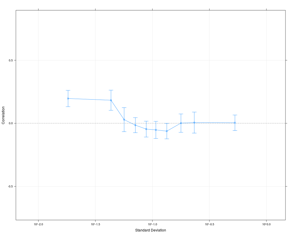
plot(cs1.rma)
# Change the plot
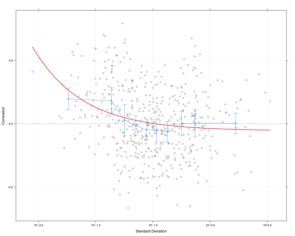
plot(cs1.rma, scatter=TRUE, curve=TRUE, alpha=0.99)
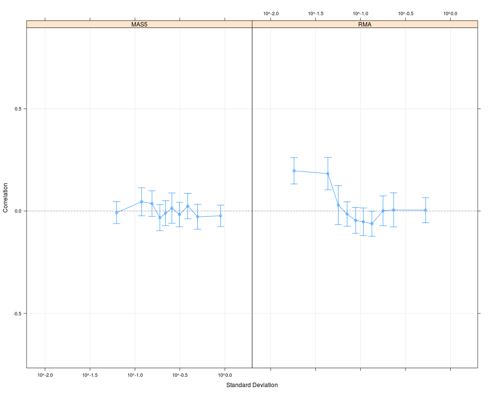
# Compare with MAS5 values for the same data set
cs1.mas5 = CorrSample(datA.mas5, 500, seed=210)
plot(cs1.rma, cs1.mas5, cond=c("RMA","MAS5"))
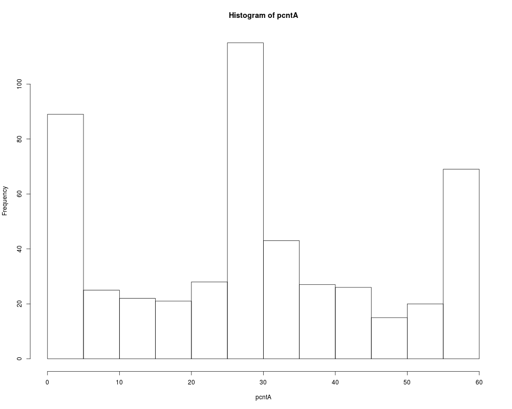
# We group pairs of gene by their average number of MAS5 present calls
pcntA = rowSums(datA.amp[cs1.mas5$ndx1, ]=="P") +
rowSums(datA.amp[cs1.mas5$ndx2, ]=="P")
hist(pcntA)
pgrpA = cut(pcntA, c(0, 20, 40, 60), include.lowest=TRUE)
table(pgrpA)
# Plot the RMA values according to their MAS5 status
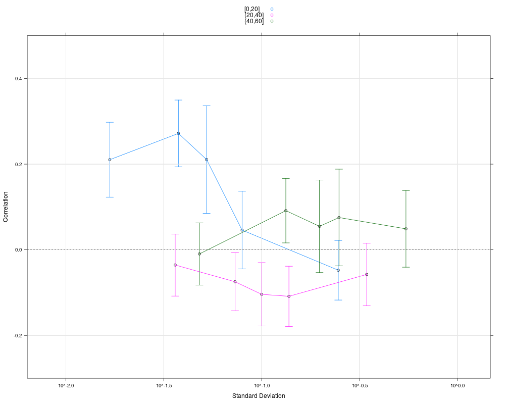
# The artificial correlation is due to gene pairs with few present calls
plot(cs1.rma, groups=pgrpA, nint=5, auto.key=TRUE, ylim=c(-0.3, 0.5))
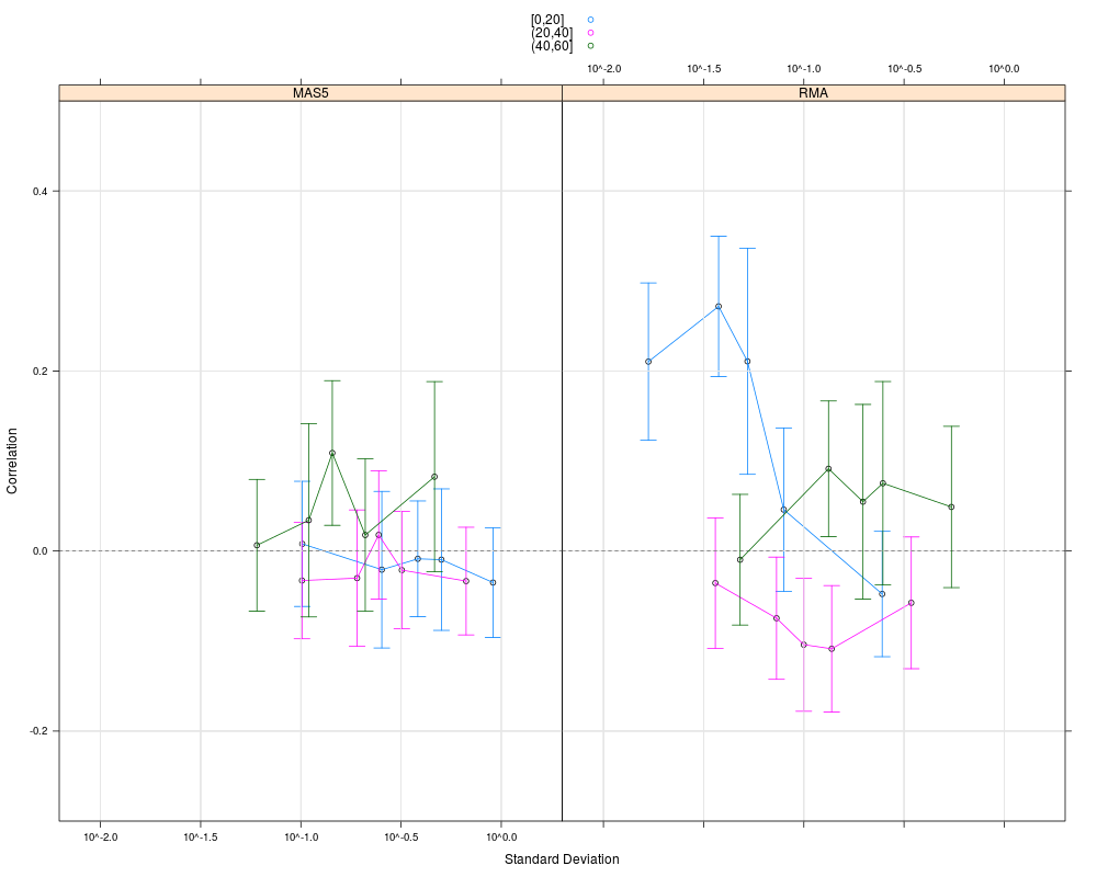
# Combine grouping and multiple conditions
plot(cs1.rma, cs1.mas5, cond=c("RMA","MAS5"), groups=list(pgrpA, pgrpA),
nint=5, auto.key=TRUE, ylim=c(-0.3, 0.5))
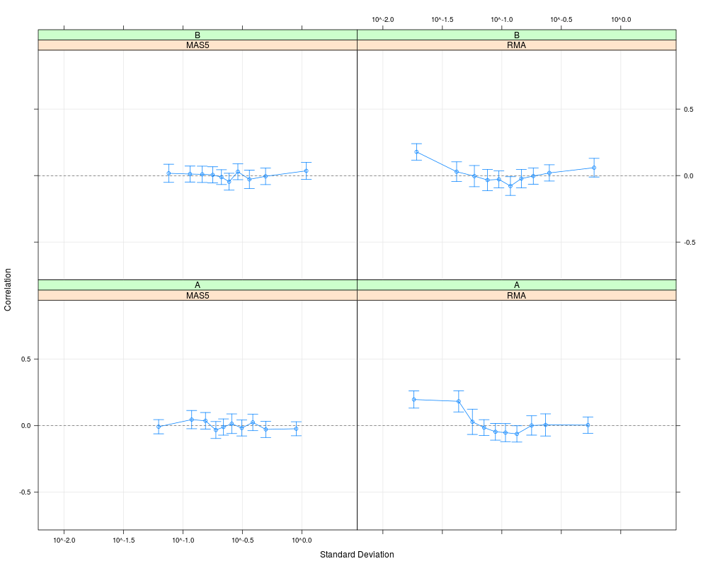
# Compare with second data set
# Specify more than one condition
cs2.rma = CorrSample(datB.rma, 500, seed=391)
cs2.mas5 = CorrSample(datB.mas5, 500, seed=391)
plot(cs1.rma, cs1.mas5, cs2.rma, cs2.mas5,
cond=list(c("RMA","MAS5","RMA","MAS5"), c("A","A","B","B")))
Results
R version 3.3.1 (2016-06-21) -- "Bug in Your Hair"
Copyright (C) 2016 The R Foundation for Statistical Computing
Platform: x86_64-pc-linux-gnu (64-bit)

R is free software and comes with ABSOLUTELY NO WARRANTY.
You are welcome to redistribute it under certain conditions.
Type 'license()' or 'licence()' for distribution details.

R is a collaborative project with many contributors.
Type 'contributors()' for more information and
'citation()' on how to cite R or R packages in publications.

Type 'demo()' for some demos, 'help()' for on-line help, or
'help.start()' for an HTML browser interface to help.
Type 'q()' to quit R.

> library(maCorrPlot)
Loading required package: lattice
> png(filename="/home/ddbj/snapshot/RGM3/R_BC/result/maCorrPlot/plot.corr.sample.Rd_%03d_medium.png", width=480, height=480)
> ### Name: plot.corr.sample
> ### Title: Plot correlation of random pairs of genes
> ### Aliases: plot.corr.sample panel.corr.sample
> ### Keywords: hplot
>
> ### ** Examples
>
> # Get small example data
> data(oligodata)
> dim(datA.rma)
[1] 1000   30
> dim(datB.rma)
[1] 1000   30
>
> # Compute the correlations for 500 random pairs,
> # Larger numbers are reasonable for larger data sets
> cs1.rma = CorrSample(datA.rma, 500, seed=210)
> plot(cs1.rma)
>
> # Change the plot
> plot(cs1.rma, scatter=TRUE, curve=TRUE, alpha=0.99)
>
> # Compare with MAS5 values for the same data set
> cs1.mas5 = CorrSample(datA.mas5, 500, seed=210)
> plot(cs1.rma, cs1.mas5, cond=c("RMA","MAS5"))
>
> # We group pairs of gene by their average number of MAS5 present calls
> pcntA = rowSums(datA.amp[cs1.mas5$ndx1, ]=="P") +
+         rowSums(datA.amp[cs1.mas5$ndx2, ]=="P")
> hist(pcntA)
> pgrpA = cut(pcntA, c(0, 20, 40, 60), include.lowest=TRUE)
> table(pgrpA)
pgrpA
 [0,20] (20,40] (40,60]
    157     213     130
>
> # Plot the RMA values according to their MAS5 status
> # The artificial correlation is due to gene pairs with few present calls
> plot(cs1.rma, groups=pgrpA, nint=5, auto.key=TRUE, ylim=c(-0.3, 0.5))
>
> # Combine grouping and multiple conditions
> plot(cs1.rma, cs1.mas5, cond=c("RMA","MAS5"), groups=list(pgrpA, pgrpA),
+      nint=5, auto.key=TRUE, ylim=c(-0.3, 0.5))
>
> # Compare with second data set
> # Specify more than one condition
> cs2.rma  = CorrSample(datB.rma, 500, seed=391)
> cs2.mas5 = CorrSample(datB.mas5, 500, seed=391)
> plot(cs1.rma, cs1.mas5, cs2.rma, cs2.mas5,
+      cond=list(c("RMA","MAS5","RMA","MAS5"), c("A","A","B","B")))
>
>
>
>
>
>
> dev.off()
null device
          1
>
|