Supported by Dr. Osamu Ogasawara and  . . |
|
Last data update: 2014.03.03 |
Draws heatmap with dendrograms.Description
Usageheatplot(dataset, dend = c("both", "row", "column", "none"), cols.default = TRUE, lowcol = "green", highcol = "red", scale="none", classvec=NULL, classvecCol=NULL, classvec2=NULL, distfun=NULL, returnSampleTree=FALSE,method="ave", dualScale=TRUE, zlim=c(-3,3),scaleKey=TRUE, ...)
Arguments
.
DetailsThe hierarchical plot is produced using average linkage cluster analysis with a
correlation metric distance. NOTE: We have changed heatplot scaling in made4 (v 1.19.1) in Bioconductor v2.5. Heatplot by default dual scales the data to limits of -3,3. To reproduce older version of heatplot, use the parameters dualScale=FALSE, scale="row". ValuePlots a heatmap with dendrogram of hierarchical cluster analysis. If returnSampleTree is TRUE, it returns an object NoteBecause Eisen et al., 1998 use green-red colours for the heatmap Author(s)Aedin Culhane ReferencesEisen MB, Spellman PT, Brown PO and Botstein D. (1998). Cluster Analysis and Display of Genome-Wide Expression Patterns. Proc Natl Acad Sci USA 95, 14863-8. See Also See also as Examples
data(khan)
## Change color scheme
heatplot(khan$train[1:30,])
heatplot(khan$train[1:30,], cols.default=FALSE, lowcol="white", highcol="red")
## Add labels to rows, columns
heatplot(khan$train[1:26,], labCol = c(64:1), labRow=LETTERS[1:26])
## Add a color bar
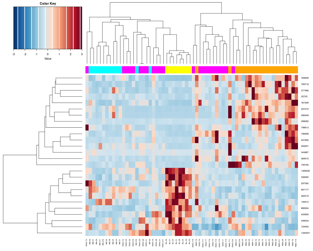
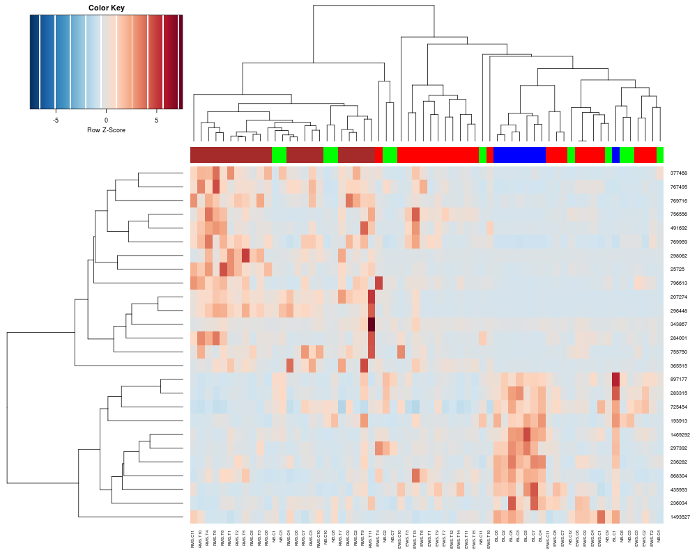
heatplot(khan$train[1:26,], classvec=khan$train.classes)
heatplot(khan$train[1:26,], classvec=khan$train.classes, classvecCol=c("magenta", "yellow", "cyan", "orange"))
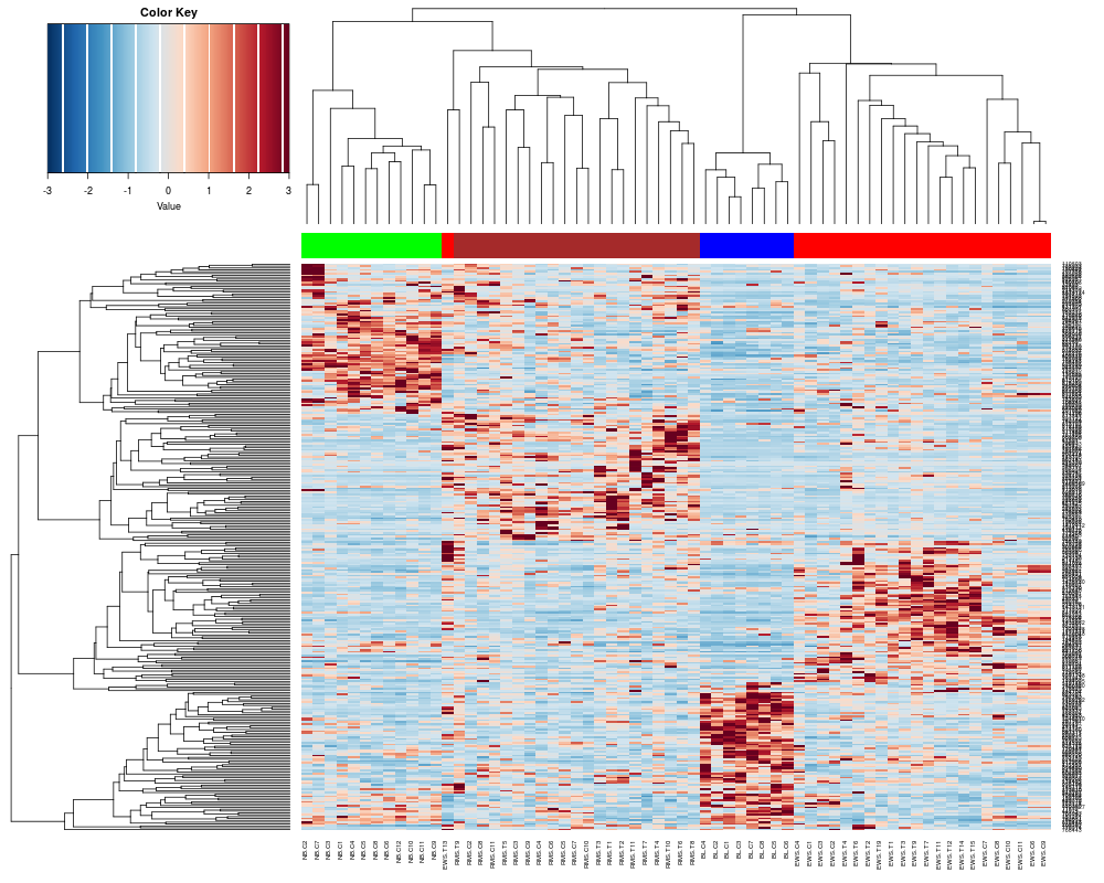
## Change the scaling to the older made4 version (pre Bioconductor 2.5)
heatplot(khan$train[1:26,], classvec=khan$train.classes, dualScale=FALSE, scale="row")
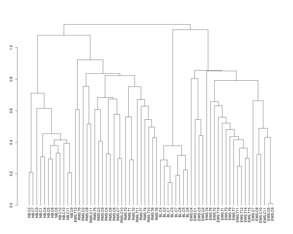
## Getting the members of a cluster and manuipulating the tree
sTree<-heatplot(khan$train, classvec=khan$train.classes, returnSampleTree=TRUE)
class(sTree)
plot(sTree)
## Cut the tree at the height=1.0
lapply(cut(sTree,h=1)$lower, labels)
## Zoom in on the first cluster
plot(cut(sTree,1)$lower[[1]])
str(cut(sTree,1.0)$lower[[1]])
## Visualizing results from an ordination using heatplot
if (require(ade4, quiet = TRUE)) {
res<-ord(khan$train, ord.nf=5) # save 5 components from correspondence analysis
khan.coa = res$ord
}
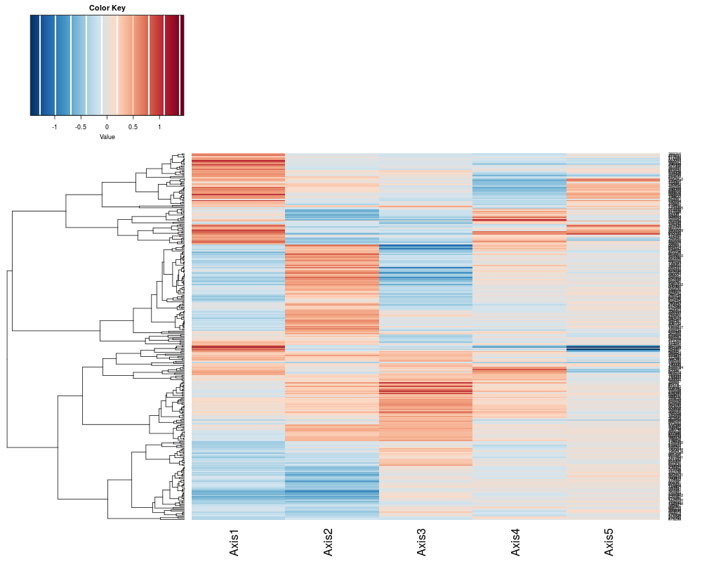
# Provides a view of the components of the Correspondence analysis (gene projection)
heatplot(khan.coa$li, dend="row", dualScale=FALSE) # first 5 components, do not cluster columns, only rows.
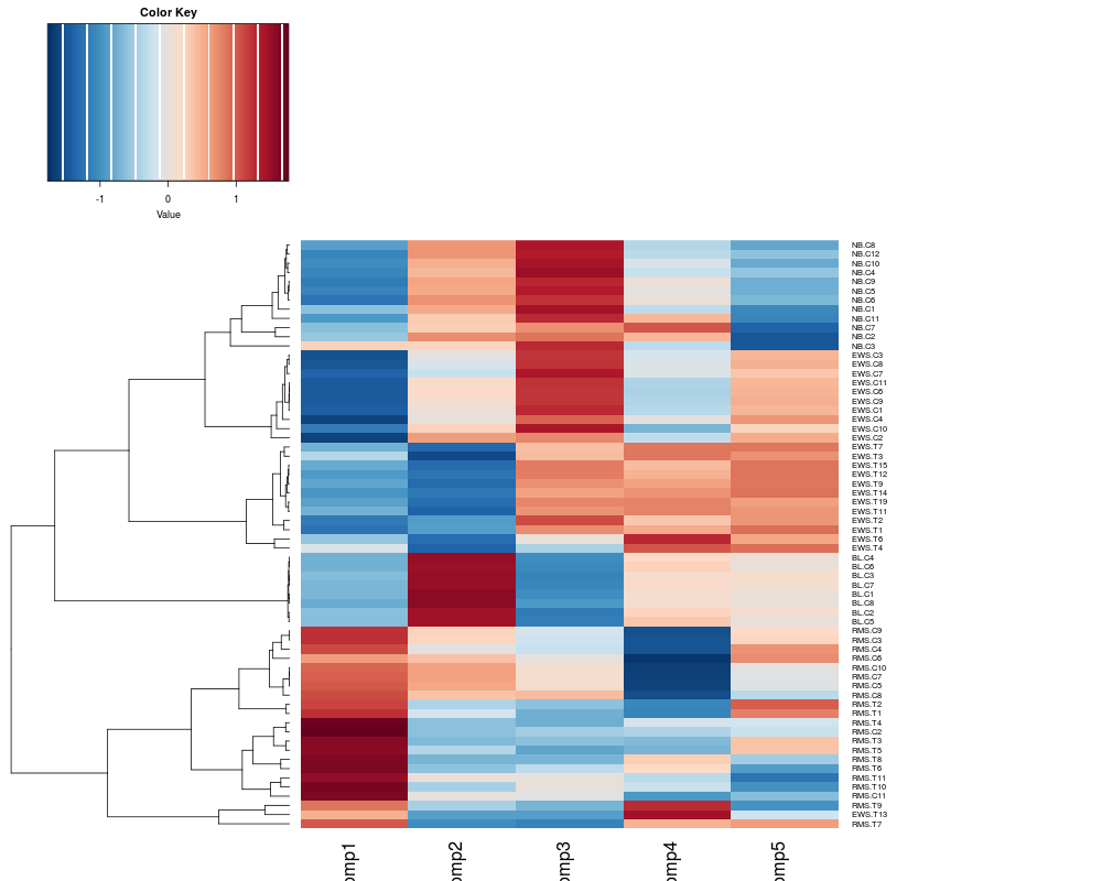
# Provides a view of the components of the Correspondence analysis (sample projection)
# The difference between tissues and cell line samples are defined in the first axis.
heatplot(khan.coa$co, margins=c(4,20), dend="row") # Change the margin size. The default is c(5,5)
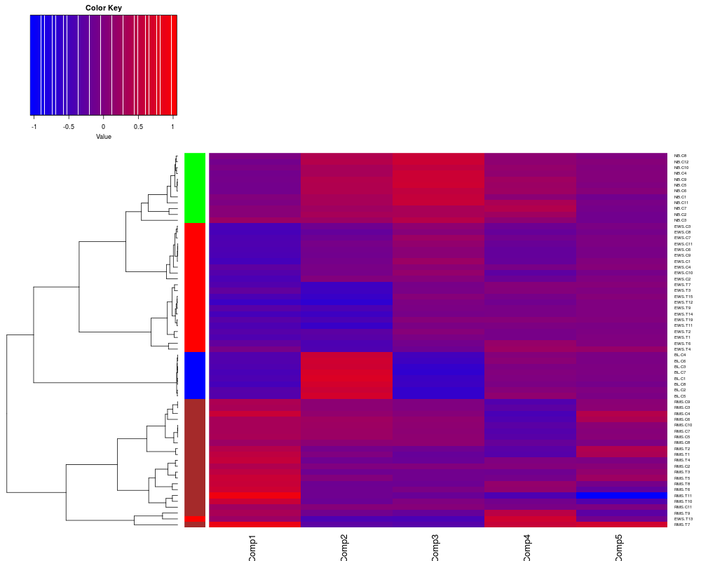
# Add a colorbar, change the heatmap color scheme and no scaling of data
heatplot(khan.coa$co,classvec2=khan$train.classes, cols.default=FALSE, lowcol="blue", dend="row", dualScale=FALSE)
apply(khan.coa$co,2, range)
Results
R version 3.3.1 (2016-06-21) -- "Bug in Your Hair"
Copyright (C) 2016 The R Foundation for Statistical Computing
Platform: x86_64-pc-linux-gnu (64-bit)
R is free software and comes with ABSOLUTELY NO WARRANTY.
You are welcome to redistribute it under certain conditions.
Type 'license()' or 'licence()' for distribution details.
R is a collaborative project with many contributors.
Type 'contributors()' for more information and
'citation()' on how to cite R or R packages in publications.
Type 'demo()' for some demos, 'help()' for on-line help, or
'help.start()' for an HTML browser interface to help.
Type 'q()' to quit R.
> library(made4)
Loading required package: ade4
Loading required package: RColorBrewer
Loading required package: gplots
Attaching package: 'gplots'
The following object is masked from 'package:stats':
lowess
Loading required package: scatterplot3d
> png(filename="/home/ddbj/snapshot/RGM3/R_BC/result/made4/heatplot.Rd_%03d_medium.png", width=480, height=480)
> ### Name: heatplot
> ### Title: Draws heatmap with dendrograms.
> ### Aliases: heatplot
> ### Keywords: hplot manip
>
> ### ** Examples
>
> data(khan)
>
> ## Change color scheme
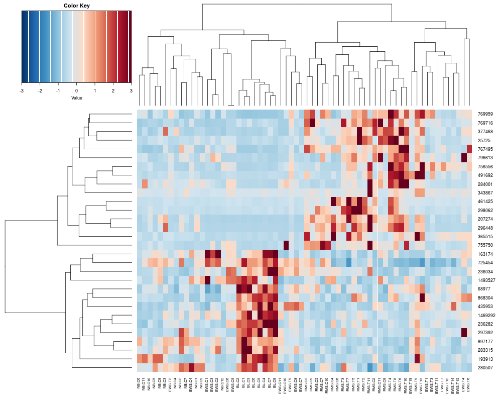
> heatplot(khan$train[1:30,])
[1] "Data (original) range: 0.01 32.66"
[1] "Data (scale) range: -1.63 7.56"
[1] "Data scaled to range: -1.63 3"
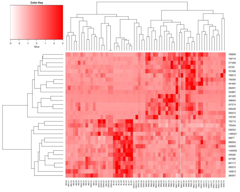
> heatplot(khan$train[1:30,], cols.default=FALSE, lowcol="white", highcol="red")
[1] "Data (original) range: 0.01 32.66"
[1] "Data (scale) range: -1.63 7.56"
[1] "Data scaled to range: -1.63 3"
>
> ## Add labels to rows, columns
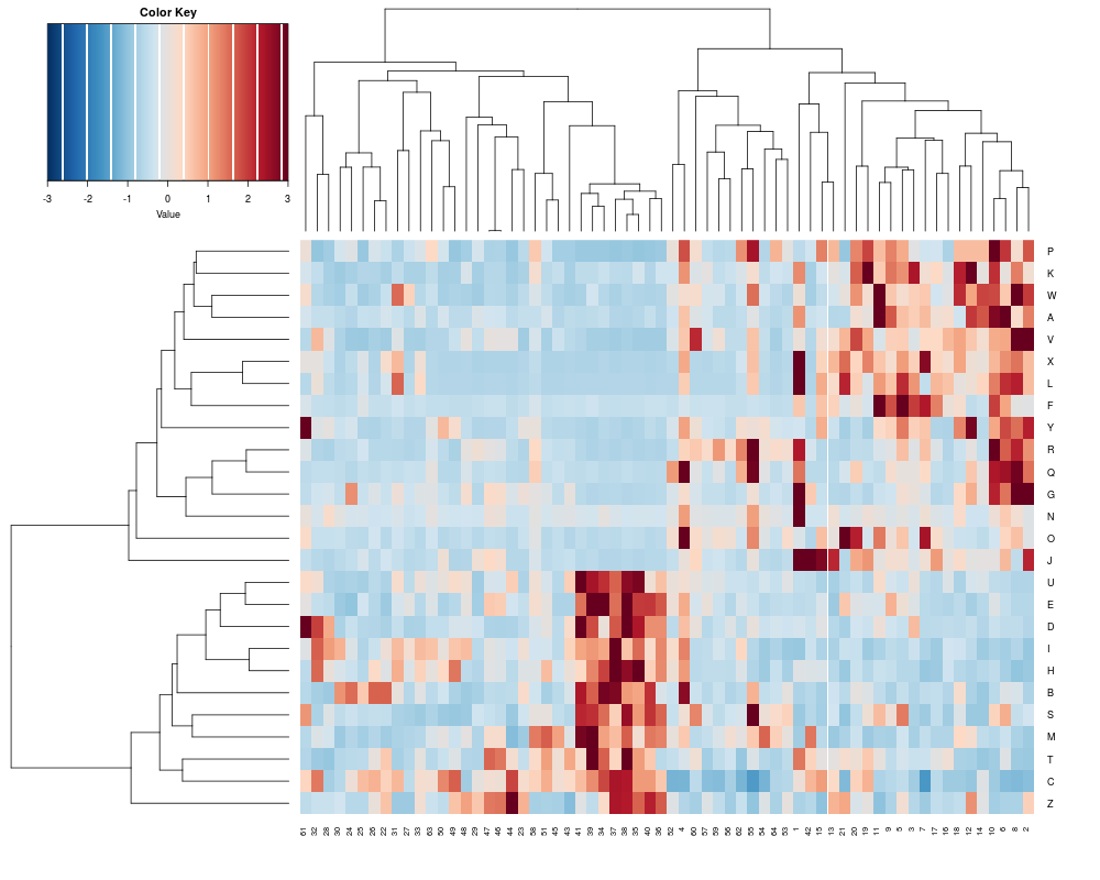
> heatplot(khan$train[1:26,], labCol = c(64:1), labRow=LETTERS[1:26])
[1] "Data (original) range: 0.01 32.66"
[1] "Data (scale) range: -1.61 7.56"
[1] "Data scaled to range: -1.61 3"
>
> ## Add a color bar
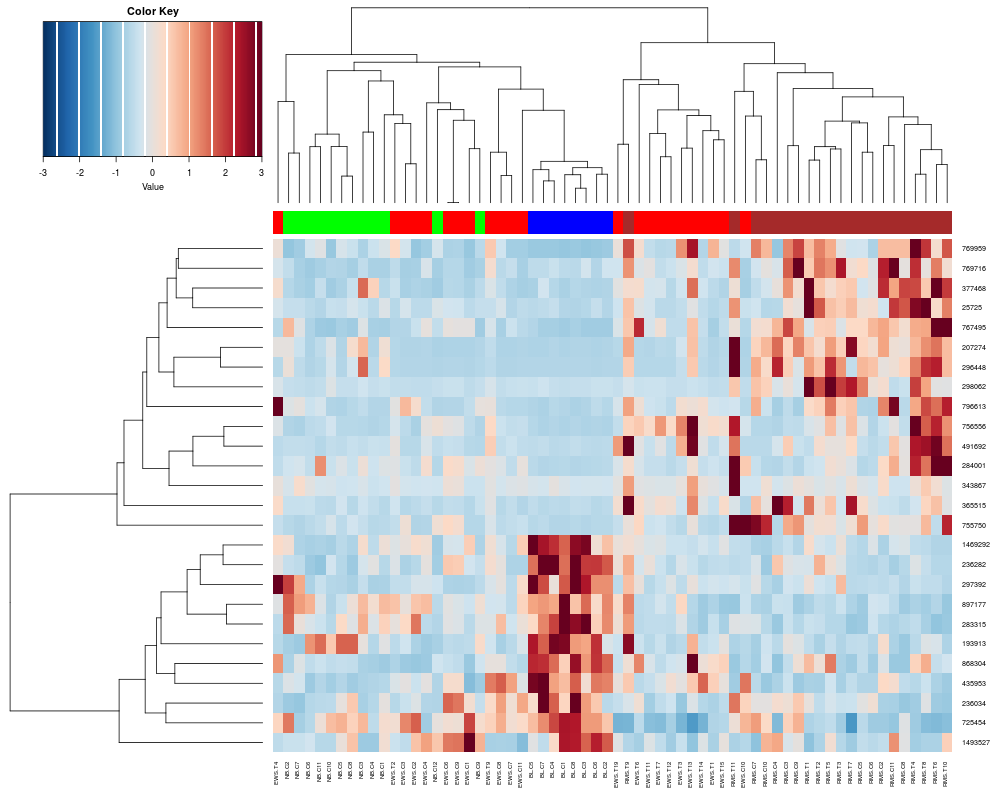
> heatplot(khan$train[1:26,], classvec=khan$train.classes)
[1] "Data (original) range: 0.01 32.66"
[1] "Data (scale) range: -1.61 7.56"
[1] "Data scaled to range: -1.61 3"
Class Color
[1,] "EWS" "red"
[2,] "BL-NHL" "blue"
[3,] "NB" "green"
[4,] "RMS" "brown"
> heatplot(khan$train[1:26,], classvec=khan$train.classes, classvecCol=c("magenta", "yellow", "cyan", "orange"))
[1] "Data (original) range: 0.01 32.66"
[1] "Data (scale) range: -1.61 7.56"
[1] "Data scaled to range: -1.61 3"
Class Color
[1,] "EWS" "magenta"
[2,] "BL-NHL" "yellow"
[3,] "NB" "cyan"
[4,] "RMS" "orange"
>
> ## Change the scaling to the older made4 version (pre Bioconductor 2.5)
> heatplot(khan$train[1:26,], classvec=khan$train.classes, dualScale=FALSE, scale="row")
Class Color
[1,] "EWS" "red"
[2,] "BL-NHL" "blue"
[3,] "NB" "green"
[4,] "RMS" "brown"
>
>
> ## Getting the members of a cluster and manuipulating the tree
> sTree<-heatplot(khan$train, classvec=khan$train.classes, returnSampleTree=TRUE)
[1] "Data (original) range: 0.01 32.66"
[1] "Data (scale) range: -1.76 7.75"
[1] "Data scaled to range: -1.76 3"
Class Color
[1,] "EWS" "red"
[2,] "BL-NHL" "blue"
[3,] "NB" "green"
[4,] "RMS" "brown"
> class(sTree)
[1] "dendrogram"
> plot(sTree)
>
> ## Cut the tree at the height=1.0
> lapply(cut(sTree,h=1)$lower, labels)
[[1]]
[1] "NB.C2" "NB.C7" "NB.C3" "NB.C1" "NB.C4" "NB.C5" "NB.C8" "NB.C6"
[9] "NB.C12" "NB.C10" "NB.C11" "NB.C9"
[[2]]
[1] "EWS.T13" "RMS.T9" "RMS.C2" "RMS.C8" "RMS.C11" "RMS.T5" "RMS.C3"
[8] "RMS.C9" "RMS.C4" "RMS.C6" "RMS.C5" "RMS.C7" "RMS.C10" "RMS.T3"
[15] "RMS.T1" "RMS.T2" "RMS.T11" "RMS.T7" "RMS.T4" "RMS.T10" "RMS.T6"
[22] "RMS.T8"
[[3]]
[1] "BL.C4" "BL.C2" "BL.C1" "BL.C3" "BL.C7" "BL.C8" "BL.C5" "BL.C6"
[[4]]
[1] "EWS.C4" "EWS.C1" "EWS.C3" "EWS.C2" "EWS.T4" "EWS.T6" "EWS.T2"
[8] "EWS.T19" "EWS.T1" "EWS.T3" "EWS.T9" "EWS.T7" "EWS.T11" "EWS.T12"
[15] "EWS.T14" "EWS.T15" "EWS.C7" "EWS.C8" "EWS.C10" "EWS.C11" "EWS.C6"
[22] "EWS.C9"
>
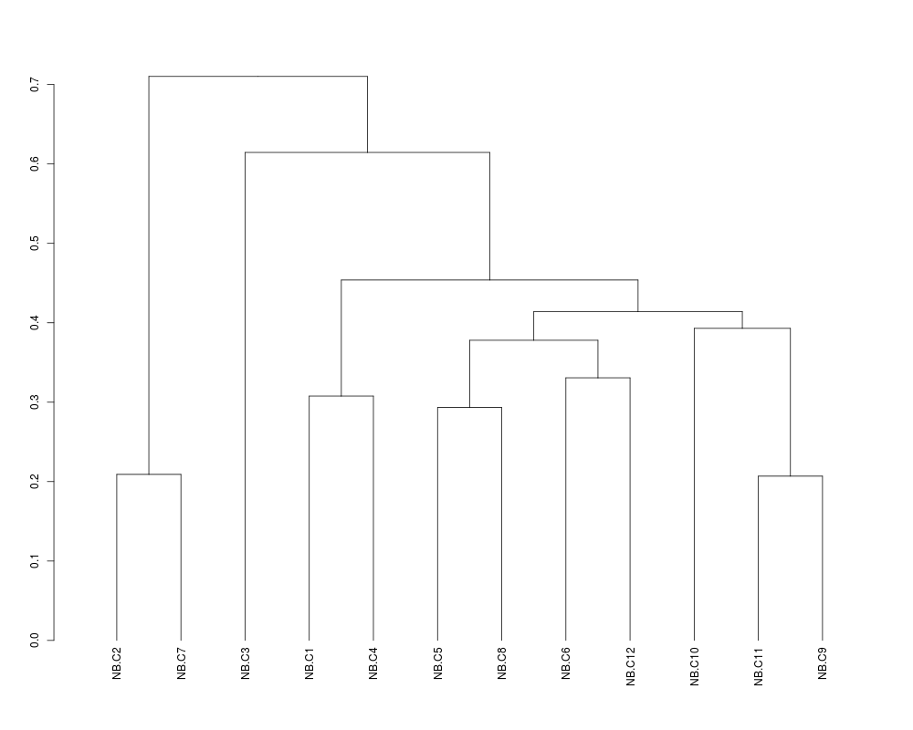
> ## Zoom in on the first cluster
> plot(cut(sTree,1)$lower[[1]])
> str(cut(sTree,1.0)$lower[[1]])
--[dendrogram w/ 2 branches and 12 members at h = 0.71]
|--[dendrogram w/ 2 branches and 2 members at h = 0.209]
| |--leaf "NB.C2"
| `--leaf "NB.C7"
`--[dendrogram w/ 2 branches and 10 members at h = 0.615]
|--leaf "NB.C3"
`--[dendrogram w/ 2 branches and 9 members at h = 0.454]
|--[dendrogram w/ 2 branches and 2 members at h = 0.308]
| |--leaf "NB.C1"
| `--leaf "NB.C4"
`--[dendrogram w/ 2 branches and 7 members at h = 0.414]
|--[dendrogram w/ 2 branches and 4 members at h = 0.378]
| |--[dendrogram w/ 2 branches and 2 members at h = 0.293]
| | |--leaf "NB.C5"
| | `--leaf "NB.C8"
| `--[dendrogram w/ 2 branches and 2 members at h = 0.331]
| |--leaf "NB.C6"
| `--leaf "NB.C12"
`--[dendrogram w/ 2 branches and 3 members at h = 0.393]
|--leaf "NB.C10"
`--[dendrogram w/ 2 branches and 2 members at h = 0.207]
|--leaf "NB.C11"
`--leaf "NB.C9"
>
>
>
> ## Visualizing results from an ordination using heatplot
> if (require(ade4, quiet = TRUE)) {
+ res<-ord(khan$train, ord.nf=5) # save 5 components from correspondence analysis
+ khan.coa = res$ord
+ }
>
> # Provides a view of the components of the Correspondence analysis (gene projection)
> heatplot(khan.coa$li, dend="row", dualScale=FALSE) # first 5 components, do not cluster columns, only rows.
[1] "row"
>
> # Provides a view of the components of the Correspondence analysis (sample projection)
> # The difference between tissues and cell line samples are defined in the first axis.
> heatplot(khan.coa$co, margins=c(4,20), dend="row") # Change the margin size. The default is c(5,5)
[1] "Data (original) range: -1.05 0.92"
[1] "Data (scale) range: -1.72 1.77"
[1] "Data scaled to range: -1.72 1.77"
[1] "row"
>
> # Add a colorbar, change the heatmap color scheme and no scaling of data
> heatplot(khan.coa$co,classvec2=khan$train.classes, cols.default=FALSE, lowcol="blue", dend="row", dualScale=FALSE)
[1] "row"
Class Color
[1,] "EWS" "red"
[2,] "BL-NHL" "blue"
[3,] "NB" "green"
[4,] "RMS" "brown"
> apply(khan.coa$co,2, range)
Comp1 Comp2 Comp3 Comp4 Comp5
[1,] -0.5651222 -0.6652120 -0.6564092 -0.4462290 -1.0545112
[2,] 0.9226546 0.7549829 0.6365143 0.6592246 0.6619864
>
>
>
>
>
>
>
> dev.off()
null device
1
>
|