Supported by Dr. Osamu Ogasawara and  . . |
|
Last data update: 2014.03.03 |
Plotting functionsDescriptionFunctions for visualizing association test results by means of a Manhattan plot and for visualizing genotypes Usage
## S4 method for signature 'AssocTestResultRanges,missing'
plot(x, y, cutoff=0.05,
     which=c("p.value", "p.value.adj", "p.value.resampled",
             "p.value.resampled.adj"), showEmpty=FALSE,
     as.dots=FALSE, pch=19, col=c("darkgrey", "grey"), scol="red",
     lcol="red", xlab=NULL, ylab=NULL, ylim=NULL, lwd=1, cex=1,
     cexXaxs=1, cexYaxs=1, srt=0, adj=c(0.5, 1), ...)
## S4 method for signature 'AssocTestResultRanges,character'
plot(x, y, cutoff=0.05,
     which=c("p.value", "p.value.adj", "p.value.resampled",
             "p.value.resampled.adj"), showEmpty=FALSE,
     as.dots=FALSE, pch=19, col=c("darkgrey", "grey"), scol="red",
     lcol="red", xlab=NULL, ylab=NULL, ylim=NULL, lwd=1, cex=1,
     cexXaxs=1, cexYaxs=1, srt=0, adj=c(0.5, 1), ...)
## S4 method for signature 'AssocTestResultRanges,GRanges'
plot(x, y, cutoff=0.05,
     which=c("p.value", "p.value.adj", "p.value.resampled",
             "p.value.resampled.adj"), showEmpty=FALSE,
     as.dots=FALSE, pch=19, col="darkgrey", scol="red", lcol="red",
     xlab=NULL, ylab=NULL, ylim=NULL, lwd=1, cex=1,
     cexXaxs=1, cexYaxs=1, ...)
## S4 method for signature 'GenotypeMatrix,missing'
plot(x, y, col="black",
     labRow=NULL, labCol=NULL, cexXaxs=(0.2 + 1 / log10(ncol(x))),
     cexYaxs=(0.2 + 1 / log10(nrow(x))), srt=90, adj=c(1, 0.5))
## S4 method for signature 'GenotypeMatrix,factor'
plot(x, y, col=rainbow(length(levels(y))),
     labRow=NULL, labCol=NULL, cexXaxs=(0.2 + 1 / log10(ncol(x))),
     cexYaxs=(0.2 + 1 / log10(nrow(x))), srt=90, adj=c(1, 0.5))
## S4 method for signature 'GenotypeMatrix,numeric'
plot(x, y, col="black", ccol="red", lwd=2,
     labRow=NULL, labCol=NULL, cexXaxs=(0.2 + 1 / log10(ncol(x))),
     cexYaxs=(0.2 + 1 / log10(nrow(x))), srt=90, adj=c(1, 0.5))
## S4 method for signature 'GRanges,character'
plot(x, y, alongGenome=FALSE,
     type=c("r", "s", "S", "l", "p", "b", "c", "h", "n"),
     xlab=NULL, ylab=NULL, col="red", lwd=2,
     cexXaxs=(0.2 + 1 / log10(length(x))), cexYaxs=1,
     frame.plot=TRUE, srt=90, adj=c(1, 0.5), ...)
Arguments
DetailsIf The optional The If If If If Valuereturns an invisible numeric vector of length 2 containing the y axis limits Author(s)Ulrich Bodenhofer bodenhofer@bioinf.jku.at Referenceshttp://www.bioinf.jku.at/software/podkat See Also
Examples
## load genome description
data(hgA)
## partition genome into overlapping windows
windows <- partitionRegions(hgA)
## load genotype data from VCF file
vcfFile <- system.file("examples/example1.vcf.gz", package="podkat")
Z <- readGenotypeMatrix(vcfFile)
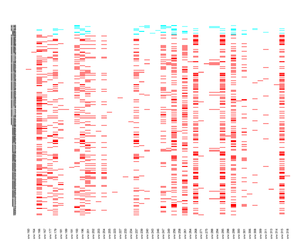
## plot some fraction of the genotype matrix
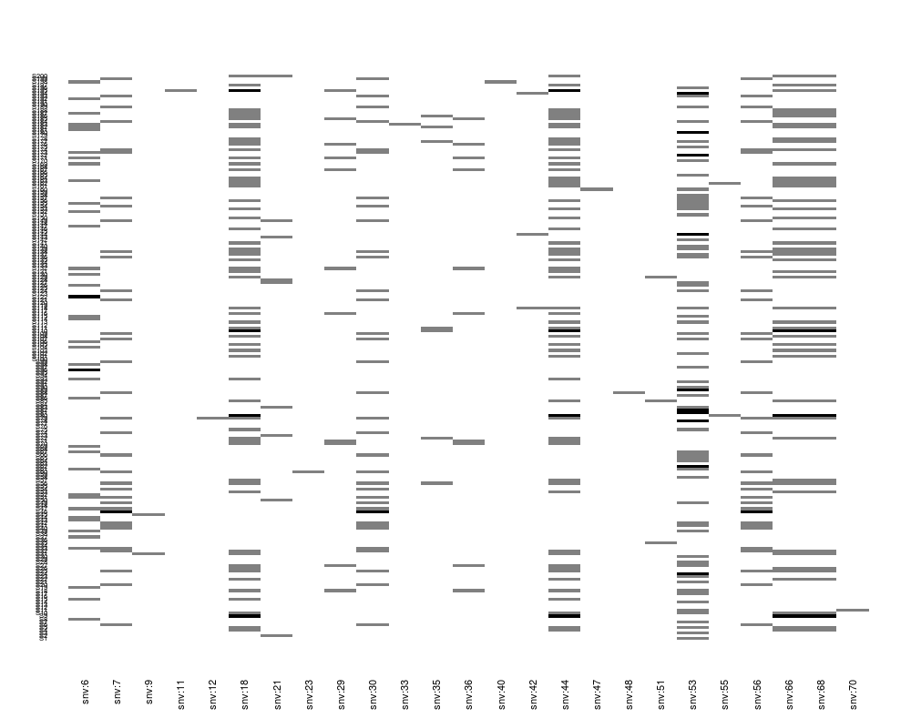
plot(Z[, 1:25])
## read phenotype data from CSV file (continuous trait + covariates)
phenoFile <- system.file("examples/example1log.csv", package="podkat")
pheno <-read.table(phenoFile, header=TRUE, sep=",")
## train null model with all covariates in data frame 'pheno'
nm.log <- nullModel(y ~ ., pheno)
## perform association test
res <- assocTest(Z, nm.log, windows)
res.adj <- p.adjust(res)
## plot results
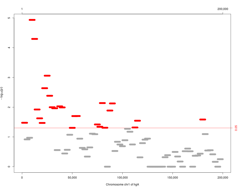
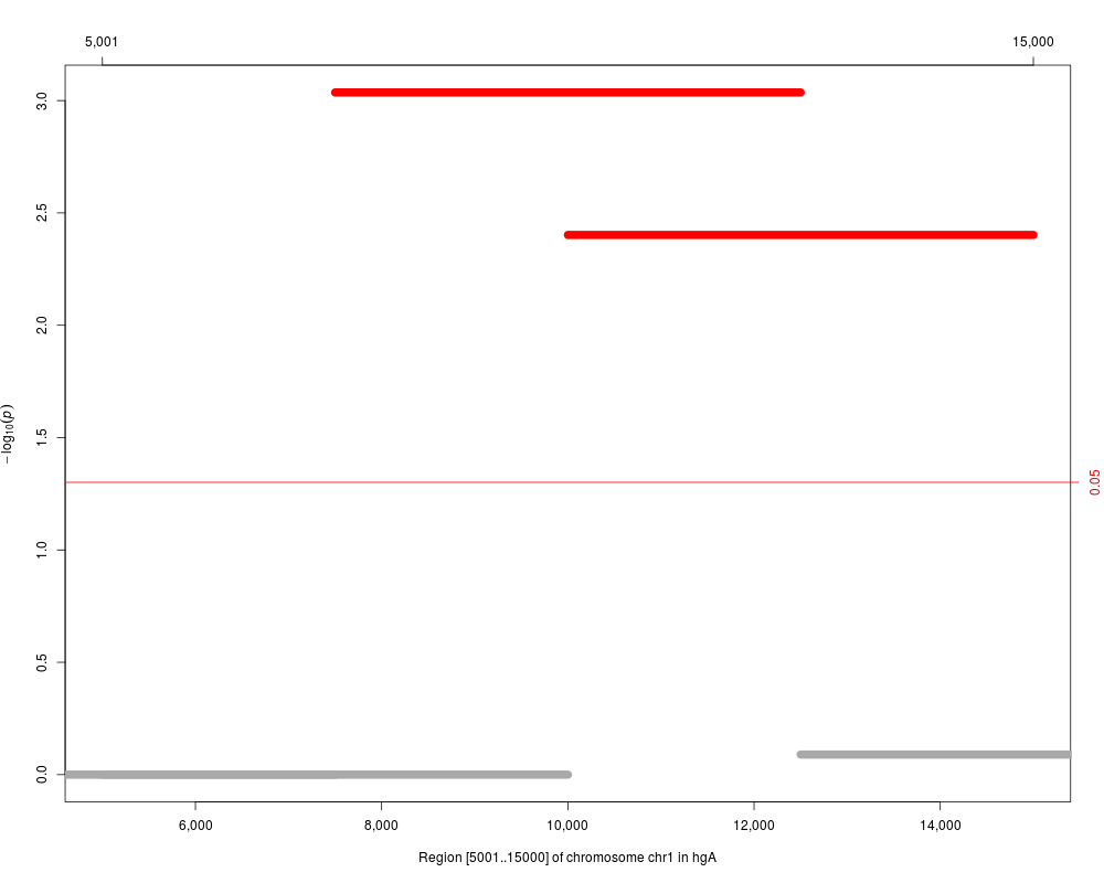
plot(res)
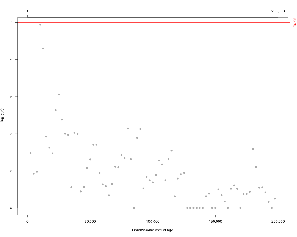
plot(res, cutoff=1.e-5, as.dots=TRUE)
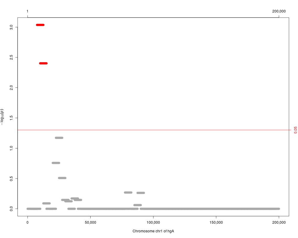
plot(res.adj, which="p.value.adj")
plot(res.adj, reduce(windows[3:5]), which="p.value.adj")
## filter regions
res.adj.f <- filterResult(res.adj, filterBy="p.value.adj")
## plot genotype grouped by target
sel <- which(overlapsAny(variantInfo(Z), reduce(res.adj.f)))
plot(Z[, sel], factor(pheno$y))
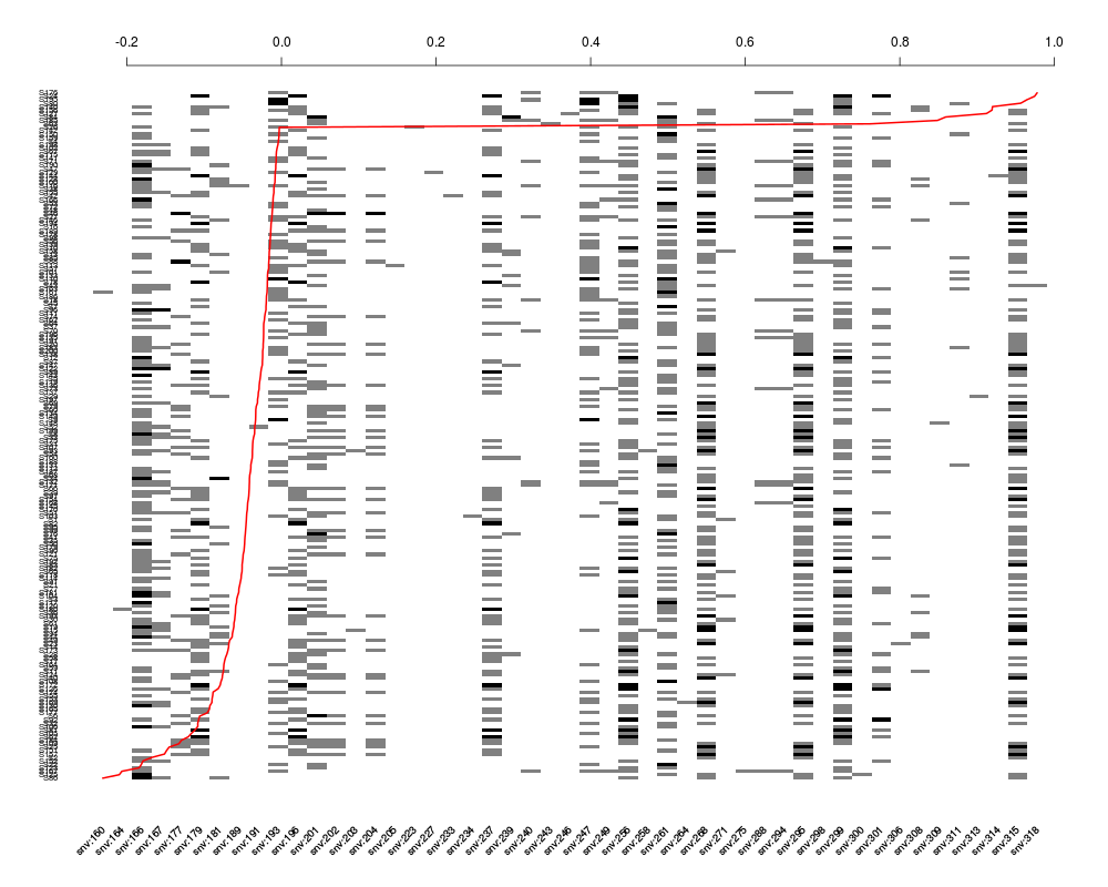
plot(Z[, sel], residuals(nm.log), srt=45)
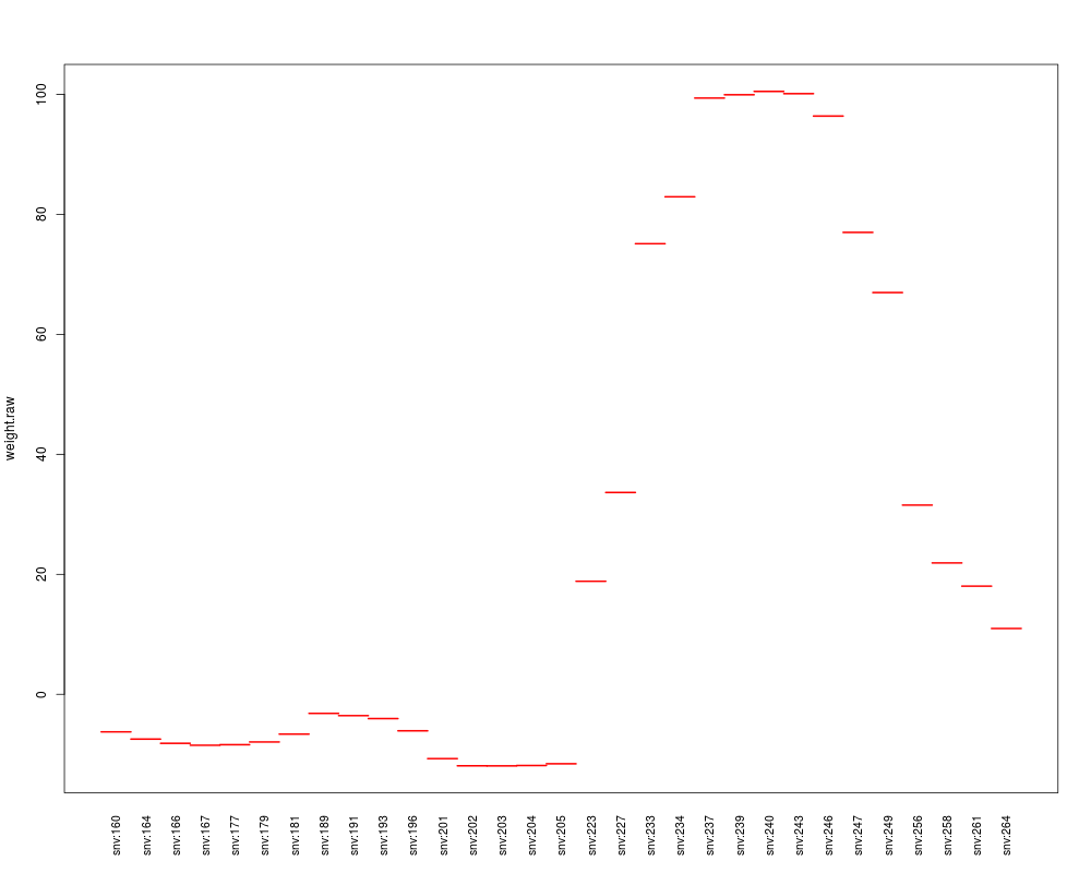
## compute contributions
contrib <- weights(res.adj.f, Z, nm.log)
contrib[[1]]
## plot contributions
plot(contrib[[1]], "weight.raw")
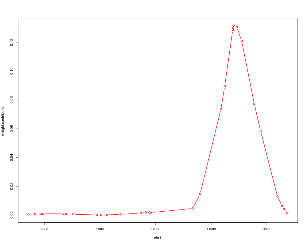
plot(contrib[[1]], "weight.contribution", type="b", alongGenome=TRUE)
Results
R version 3.3.1 (2016-06-21) -- "Bug in Your Hair"
Copyright (C) 2016 The R Foundation for Statistical Computing
Platform: x86_64-pc-linux-gnu (64-bit)

R is free software and comes with ABSOLUTELY NO WARRANTY.
You are welcome to redistribute it under certain conditions.
Type 'license()' or 'licence()' for distribution details.

R is a collaborative project with many contributors.
Type 'contributors()' for more information and
'citation()' on how to cite R or R packages in publications.

Type 'demo()' for some demos, 'help()' for on-line help, or
'help.start()' for an HTML browser interface to help.
Type 'q()' to quit R.

> library(podkat)
Loading required package: Rsamtools
Loading required package: GenomeInfoDb
Loading required package: stats4
Loading required package: BiocGenerics
Loading required package: parallel

Attaching package: 'BiocGenerics'

The following objects are masked from 'package:parallel':

    clusterApply, clusterApplyLB, clusterCall, clusterEvalQ,
    clusterExport, clusterMap, parApply, parCapply, parLapply,
    parLapplyLB, parRapply, parSapply, parSapplyLB

The following objects are masked from 'package:stats':

    IQR, mad, xtabs

The following objects are masked from 'package:base':

    Filter, Find, Map, Position, Reduce, anyDuplicated, append,
    as.data.frame, cbind, colnames, do.call, duplicated, eval, evalq,
    get, grep, grepl, intersect, is.unsorted, lapply, lengths, mapply,
    match, mget, order, paste, pmax, pmax.int, pmin, pmin.int, rank,
    rbind, rownames, sapply, setdiff, sort, table, tapply, union,
    unique, unsplit

Loading required package: S4Vectors

Attaching package: 'S4Vectors'

The following objects are masked from 'package:base':

    colMeans, colSums, expand.grid, rowMeans, rowSums

Loading required package: IRanges
Loading required package: GenomicRanges
Loading required package: Biostrings
Loading required package: XVector
> png(filename="/home/ddbj/snapshot/RGM3/R_BC/result/podkat/plot-methods.Rd_%03d_medium.png", width=480, height=480)
> ### Name: plot
> ### Title: Plotting functions
> ### Aliases: plot plot-methods plot,AssocTestResultRanges,missing-method
> ###   plot,AssocTestResultRanges,character-method
> ###   plot,AssocTestResultRanges,GRanges-method
> ###   plot,GenotypeMatrix,missing-method plot,GenotypeMatrix,factor-method
> ###   plot,GenotypeMatrix,numeric-method plot,GRanges,character-method
> ### Keywords: methods
>
> ### ** Examples
>
> ## load genome description
> data(hgA)
>
> ## partition genome into overlapping windows
> windows <- partitionRegions(hgA)
>
> ## load genotype data from VCF file
> vcfFile <- system.file("examples/example1.vcf.gz", package="podkat")
> Z <- readGenotypeMatrix(vcfFile)
>
> ## plot some fraction of the genotype matrix
> plot(Z[, 1:25])
>
> ## read phenotype data from CSV file (continuous trait + covariates)
> phenoFile <- system.file("examples/example1log.csv", package="podkat")
> pheno <-read.table(phenoFile, header=TRUE, sep=",")
>
> ## train null model with all covariates in data frame 'pheno'
> nm.log <- nullModel(y ~ ., pheno)
small sample correction applied
>
> ## perform association test
> res <- assocTest(Z, nm.log, windows)
> res.adj <- p.adjust(res)
>
> ## plot results
> plot(res)
> plot(res, cutoff=1.e-5, as.dots=TRUE)
> plot(res.adj, which="p.value.adj")
> plot(res.adj, reduce(windows[3:5]), which="p.value.adj")
>
> ## filter regions
> res.adj.f <- filterResult(res.adj, filterBy="p.value.adj")
>
> ## plot genotype grouped by target
> sel <- which(overlapsAny(variantInfo(Z), reduce(res.adj.f)))
> plot(Z[, sel], factor(pheno$y))
> plot(Z[, sel], residuals(nm.log), srt=45)
>
> ## compute contributions
> contrib <- weights(res.adj.f, Z, nm.log)
> contrib[[1]]
GRanges object with 31 ranges and 2 metadata columns:
          seqnames         ranges strand |        weight.raw
             <Rle>      <IRanges>  <Rle> |         <numeric>
  snv:160     chr1   [7713, 7713]      * | -6.26517762314755
  snv:164     chr1   [7834, 7834]      * | -7.47145138943176
  snv:166     chr1   [7932, 7932]      * |  -8.1742677399741
  snv:167     chr1   [7976, 7976]      * | -8.49700268877644
  snv:177     chr1   [8342, 8342]      * | -8.40629643967383
      ...      ...            ...    ... .               ...
  snv:249     chr1 [11888, 11888]      * |   66.962036514389
  snv:256     chr1 [12191, 12191]      * |  31.5349635964424
  snv:258     chr1 [12273, 12273]      * |  21.8922462931601
  snv:261     chr1 [12307, 12307]      * |  18.0223719598762
  snv:264     chr1 [12369, 12369]      * |  10.9659038227535
           weight.contribution
                     <numeric>
  snv:160 0.000511278661859377
  snv:164 0.000727111212932719
  snv:166 0.000870339328400399
  snv:167 0.000940421182884121
  snv:177 0.000920450193677578
      ...                  ...
  snv:249   0.0584047539126716
  snv:256   0.0129531549164573
  snv:258  0.00624268674043257
  snv:261    0.004230724925375
  snv:264  0.00156631734327101
  -------
  seqinfo: 1 sequence from hgA genome
>
> ## plot contributions
> plot(contrib[[1]], "weight.raw")
> plot(contrib[[1]], "weight.contribution", type="b", alongGenome=TRUE)
>
>
>
>
>
> dev.off()
null device
          1
>
|