Supported by Dr. Osamu Ogasawara and  . . |
|
Last data update: 2014.03.03 |
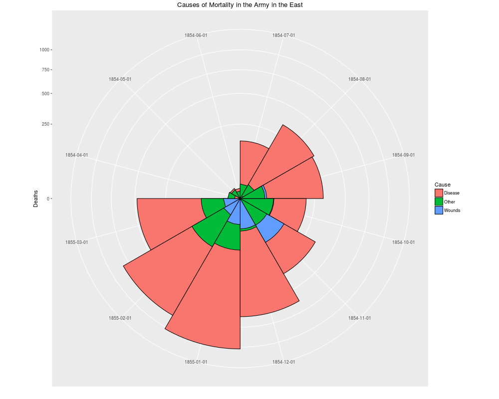
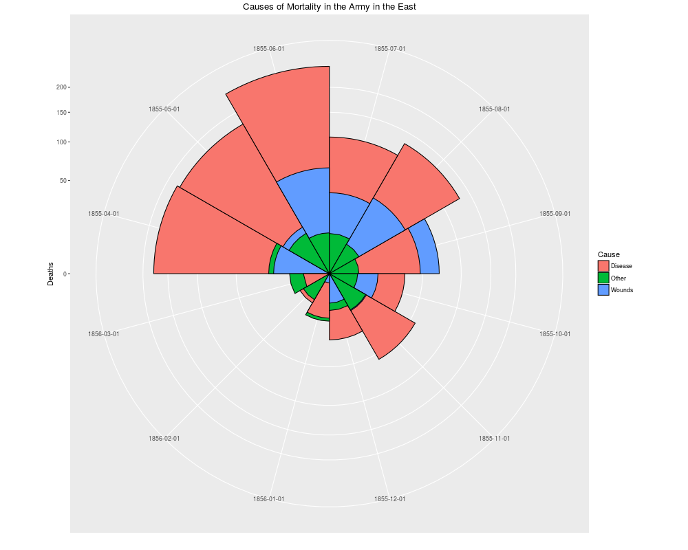
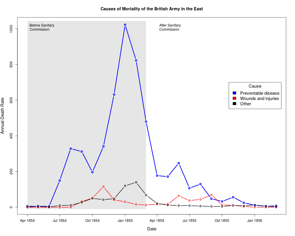
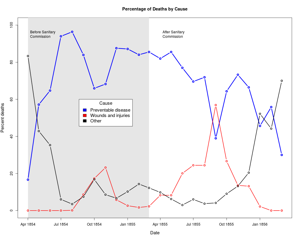
Florence Nightingale's data on deaths from various causes in the Crimean WarDescriptionIn the history of data visualization, Florence Nightingale is best remembered for her role as a social activist and her view that statistical data, presented in charts and diagrams, could be used as powerful arguments for medical reform. After witnessing deplorable sanitary conditions in the Crimea, she wrote several influential texts (Nightingale, 1858, 1859), including polar-area graphs (sometimes called "Coxcombs" or rose diagrams), showing the number of deaths in the Crimean from battle compared to disease or preventable causes that could be reduced by better battlefield nursing care. Her Diagram of the Causes of Mortality in the Army in the East showed that most of the British soldiers who died during the Crimean War died of sickness rather than of wounds or other causes. It also showed that the death rate was higher in the first year of the war, before a Sanitary Commissioners arrived in March 1855 to improve hygiene in the camps and hospitals. Usagedata(Nightingale) FormatA data frame with 24 observations on the following 10 variables.
DetailsFor a given cause of death, The two panels of Nightingale's Coxcomb correspond to dates before and after March 1855 SourceThe data were obtained from: Pearson, M. and Short, I. (2007). Understanding Uncertainty: Mathematics of the Coxcomb. http://understandinguncertainty.org/node/214. ReferencesNightingale, F. (1858) Notes on Matters Affecting the Health, Efficiency, and Hospital Administration of the British Army Harrison and Sons, 1858 Nightingale, F. (1859) A Contribution to the Sanitary History of the British Army during the Late War with Russia London: John W. Parker and Son. Small, H. (1998) Florence Nightingale's statistical diagrams http://www.florence-nightingale-avenging-angel.co.uk/GraphicsPaper/Graphics.htm Pearson, M. and Short, I. (2008) Nightingale's Rose (flash animation). http://understandinguncertainty.org/files/animations/Nightingale11/Nightingale1.html Examples
data(Nightingale)

# For some graphs, it is more convenient to reshape death rates to long format
#  keep only Date and death rates
require(reshape)
Night<- Nightingale[,c(1,8:10)]
melted <- melt(Night, "Date")
names(melted) <- c("Date", "Cause", "Deaths")
melted$Cause <- sub("\.rate", "", melted$Cause)
melted$Regime <- ordered( rep(c(rep('Before', 12), rep('After', 12)), 3),
                          levels=c('Before', 'After'))
Night <- melted

# subsets, to facilitate separate plotting
Night1 <- subset(Night, Date < as.Date("1855-04-01"))
Night2 <- subset(Night, Date >= as.Date("1855-04-01"))

# sort according to Deaths in decreasing order, so counts are not obscured [thx: Monique Graf]
Night1 <- Night1[order(Night1$Deaths, decreasing=TRUE),]
Night2 <- Night2[order(Night2$Deaths, decreasing=TRUE),]

# merge the two sorted files
Night <- rbind(Night1, Night2)


require(ggplot2)
# Before plot
cxc1 <- ggplot(Night1, aes(x = factor(Date), y=Deaths, fill = Cause)) +
		# do it as a stacked bar chart first
   geom_bar(width = 1, position="identity", stat="identity", color="black") +
		# set scale so area ~ Deaths
   scale_y_sqrt()
		# A coxcomb plot = bar chart + polar coordinates
cxc1 + coord_polar(start=3*pi/2) +
	ggtitle("Causes of Mortality in the Army in the East") +
	xlab("")

# After plot
cxc2 <- ggplot(Night2, aes(x = factor(Date), y=Deaths, fill = Cause)) +
   geom_bar(width = 1, position="identity", stat="identity", color="black") +
   scale_y_sqrt()
cxc2 + coord_polar(start=3*pi/2) +
	ggtitle("Causes of Mortality in the Army in the East") +
	xlab("")

## Not run:
# do both together, with faceting
cxc <- ggplot(Night, aes(x = factor(Date), y=Deaths, fill = Cause)) +
 geom_bar(width = 1, position="identity", stat="identity", color="black") +
 scale_y_sqrt() +
 facet_grid(. ~ Regime, scales="free", labeller=label_both)
cxc + coord_polar(start=3*pi/2) +
	ggtitle("Causes of Mortality in the Army in the East") +
	xlab("")

## End(Not run)

## What if she had made a set of line graphs?

# these plots are best viewed with width ~ 2 * height
colors <- c("blue", "red", "black")
with(Nightingale, {
	plot(Date, Disease.rate, type="n", cex.lab=1.25,
		ylab="Annual Death Rate", xlab="Date", xaxt="n",
		main="Causes of Mortality of the British Army in the East");
	# background, to separate before, after
	rect(as.Date("1854/4/1"), -10, as.Date("1855/3/1"),
		1.02*max(Disease.rate), col=gray(.90), border="transparent");
	text( as.Date("1854/4/1"), .98*max(Disease.rate), "Before Sanitary\nCommission", pos=4);
	text( as.Date("1855/4/1"), .98*max(Disease.rate), "After Sanitary\nCommission", pos=4);
	# plot the data
	points(Date, Disease.rate, type="b", col=colors[1], lwd=3);
	points(Date, Wounds.rate, type="b", col=colors[2], lwd=2);
	points(Date, Other.rate, type="b", col=colors[3], lwd=2)
	}
)
# add custom Date axis and legend
axis.Date(1, at=seq(as.Date("1854/4/1"), as.Date("1856/3/1"), "3 months"), format="%b %Y")
legend(as.Date("1855/10/20"), 700, c("Preventable disease", "Wounds and injuries", "Other"),
	col=colors, fill=colors, title="Cause", cex=1.25)

# Alternatively, show each cause of death as percent of total
Nightingale <- within(Nightingale, {
	Total <- Disease + Wounds + Other
	Disease.pct <- 100*Disease/Total
	Wounds.pct <- 100*Wounds/Total
	Other.pct <- 100*Other/Total
	})

colors <- c("blue", "red", "black")
with(Nightingale, {
	plot(Date, Disease.pct, type="n",  ylim=c(0,100), cex.lab=1.25,
		ylab="Percent deaths", xlab="Date", xaxt="n",
		main="Percentage of Deaths by Cause");
	# background, to separate before, after
	rect(as.Date("1854/4/1"), -10, as.Date("1855/3/1"),
		1.02*max(Disease.rate), col=gray(.90), border="transparent");
	text( as.Date("1854/4/1"), .98*max(Disease.pct), "Before Sanitary\nCommission", pos=4);
	text( as.Date("1855/4/1"), .98*max(Disease.pct), "After Sanitary\nCommission", pos=4);
	# plot the data
	points(Date, Disease.pct, type="b", col=colors[1], lwd=3);
	points(Date, Wounds.pct, type="b", col=colors[2], lwd=2);
	points(Date, Other.pct, type="b", col=colors[3], lwd=2)
	}
)
# add custom Date axis and legend
axis.Date(1, at=seq(as.Date("1854/4/1"), as.Date("1856/3/1"), "3 months"), format="%b %Y")
legend(as.Date("1854/8/20"), 60, c("Preventable disease", "Wounds and injuries", "Other"),
	col=colors, fill=colors, title="Cause", cex=1.25)
Results
R version 3.3.1 (2016-06-21) -- "Bug in Your Hair"
Copyright (C) 2016 The R Foundation for Statistical Computing
Platform: x86_64-pc-linux-gnu (64-bit)

R is free software and comes with ABSOLUTELY NO WARRANTY.
You are welcome to redistribute it under certain conditions.
Type 'license()' or 'licence()' for distribution details.

R is a collaborative project with many contributors.
Type 'contributors()' for more information and
'citation()' on how to cite R or R packages in publications.

Type 'demo()' for some demos, 'help()' for on-line help, or
'help.start()' for an HTML browser interface to help.
Type 'q()' to quit R.

> library(HistData)
> png(filename="/home/ddbj/snapshot/RGM3/R_CC/result/HistData/Nightingale.Rd_%03d_medium.png", width=480, height=480)
> ### Name: Nightingale
> ### Title: Florence Nightingale's data on deaths from various causes in the
> ###   Crimean War
> ### Aliases: Nightingale
> ### Keywords: datasets
>
> ### ** Examples
>
> data(Nightingale)
>
> # For some graphs, it is more convenient to reshape death rates to long format
> #  keep only Date and death rates
> require(reshape)
Loading required package: reshape
> Night<- Nightingale[,c(1,8:10)]
> melted <- melt(Night, "Date")
> names(melted) <- c("Date", "Cause", "Deaths")
> melted$Cause <- sub("\.rate", "", melted$Cause)
> melted$Regime <- ordered( rep(c(rep('Before', 12), rep('After', 12)), 3),
+                           levels=c('Before', 'After'))
> Night <- melted
>
> # subsets, to facilitate separate plotting
> Night1 <- subset(Night, Date < as.Date("1855-04-01"))
> Night2 <- subset(Night, Date >= as.Date("1855-04-01"))
>
> # sort according to Deaths in decreasing order, so counts are not obscured [thx: Monique Graf]
> Night1 <- Night1[order(Night1$Deaths, decreasing=TRUE),]
> Night2 <- Night2[order(Night2$Deaths, decreasing=TRUE),]
>
> # merge the two sorted files
> Night <- rbind(Night1, Night2)
>
>
> require(ggplot2)
Loading required package: ggplot2
> # Before plot
> cxc1 <- ggplot(Night1, aes(x = factor(Date), y=Deaths, fill = Cause)) +
+ 		# do it as a stacked bar chart first
+    geom_bar(width = 1, position="identity", stat="identity", color="black") +
+ 		# set scale so area ~ Deaths
+    scale_y_sqrt()
> 		# A coxcomb plot = bar chart + polar coordinates
> cxc1 + coord_polar(start=3*pi/2) +
+ 	ggtitle("Causes of Mortality in the Army in the East") +
+ 	xlab("")
>
> # After plot
> cxc2 <- ggplot(Night2, aes(x = factor(Date), y=Deaths, fill = Cause)) +
+    geom_bar(width = 1, position="identity", stat="identity", color="black") +
+    scale_y_sqrt()
> cxc2 + coord_polar(start=3*pi/2) +
+ 	ggtitle("Causes of Mortality in the Army in the East") +
+ 	xlab("")
>
> ## Not run:
> ##D # do both together, with faceting
> ##D cxc <- ggplot(Night, aes(x = factor(Date), y=Deaths, fill = Cause)) +
> ##D  geom_bar(width = 1, position="identity", stat="identity", color="black") +
> ##D  scale_y_sqrt() +
> ##D  facet_grid(. ~ Regime, scales="free", labeller=label_both)
> ##D cxc + coord_polar(start=3*pi/2) +
> ##D 	ggtitle("Causes of Mortality in the Army in the East") +
> ##D 	xlab("")
> ## End(Not run)
>
> ## What if she had made a set of line graphs?
>
> # these plots are best viewed with width ~ 2 * height
> colors <- c("blue", "red", "black")
> with(Nightingale, {
+ 	plot(Date, Disease.rate, type="n", cex.lab=1.25,
+ 		ylab="Annual Death Rate", xlab="Date", xaxt="n",
+ 		main="Causes of Mortality of the British Army in the East");
+ 	# background, to separate before, after
+ 	rect(as.Date("1854/4/1"), -10, as.Date("1855/3/1"),
+ 		1.02*max(Disease.rate), col=gray(.90), border="transparent");
+ 	text( as.Date("1854/4/1"), .98*max(Disease.rate), "Before Sanitary\nCommission", pos=4);
+ 	text( as.Date("1855/4/1"), .98*max(Disease.rate), "After Sanitary\nCommission", pos=4);
+ 	# plot the data
+ 	points(Date, Disease.rate, type="b", col=colors[1], lwd=3);
+ 	points(Date, Wounds.rate, type="b", col=colors[2], lwd=2);
+ 	points(Date, Other.rate, type="b", col=colors[3], lwd=2)
+ 	}
+ )
> # add custom Date axis and legend
> axis.Date(1, at=seq(as.Date("1854/4/1"), as.Date("1856/3/1"), "3 months"), format="%b %Y")
> legend(as.Date("1855/10/20"), 700, c("Preventable disease", "Wounds and injuries", "Other"),
+ 	col=colors, fill=colors, title="Cause", cex=1.25)
>
> # Alternatively, show each cause of death as percent of total
> Nightingale <- within(Nightingale, {
+ 	Total <- Disease + Wounds + Other
+ 	Disease.pct <- 100*Disease/Total
+ 	Wounds.pct <- 100*Wounds/Total
+ 	Other.pct <- 100*Other/Total
+ 	})
>
> colors <- c("blue", "red", "black")
> with(Nightingale, {
+ 	plot(Date, Disease.pct, type="n",  ylim=c(0,100), cex.lab=1.25,
+ 		ylab="Percent deaths", xlab="Date", xaxt="n",
+ 		main="Percentage of Deaths by Cause");
+ 	# background, to separate before, after
+ 	rect(as.Date("1854/4/1"), -10, as.Date("1855/3/1"),
+ 		1.02*max(Disease.rate), col=gray(.90), border="transparent");
+ 	text( as.Date("1854/4/1"), .98*max(Disease.pct), "Before Sanitary\nCommission", pos=4);
+ 	text( as.Date("1855/4/1"), .98*max(Disease.pct), "After Sanitary\nCommission", pos=4);
+ 	# plot the data
+ 	points(Date, Disease.pct, type="b", col=colors[1], lwd=3);
+ 	points(Date, Wounds.pct, type="b", col=colors[2], lwd=2);
+ 	points(Date, Other.pct, type="b", col=colors[3], lwd=2)
+ 	}
+ )
> # add custom Date axis and legend
> axis.Date(1, at=seq(as.Date("1854/4/1"), as.Date("1856/3/1"), "3 months"), format="%b %Y")
> legend(as.Date("1854/8/20"), 60, c("Preventable disease", "Wounds and injuries", "Other"),
+ 	col=colors, fill=colors, title="Cause", cex=1.25)
>
>
>
>
>
>
> dev.off()
null device
          1
>
|